The useful version of the question “what season am I?” is not about earning a permanent label. It is about noticing why one blue makes your eyes look clear while another leaves your face looking tired, or why a favourite lipstick works only when the rest of an outfit is quiet. Seasonal color analysis gives those observations a vocabulary. Used lightly, it can make getting dressed, choosing hair colour, and shopping for makeup far less random.
What the four seasons are trying to describe
Spring, Summer, Autumn, and Winter are shorthand for families of colours that tend to echo a person’s natural colouring. Spring is usually warm and lively: think clear coral, leaf green, warm turquoise, and light camel. Summer is cooler and gentler, with misty rose, denim, soft navy, and lavender. Autumn also leans warm, but its colours are deeper and more muted: olive, rust, petrol blue, chocolate, and moss. Winter is cool, high-contrast, and often crisp, with black, icy pink, cobalt, cherry red, and clean white.
That description is deliberately broad. A season is not determined by eye colour, ancestry, hair colour, or whether someone tans. Two people with brown eyes can look best in completely different palettes. The point is to compare the way a colour behaves beside the face: does skin look even, lips look defined, and the eyes remain visible? Or does the colour arrive first and make the person seem dull, shadowed, or unfinished?
Use temperature, value, and chroma before looking for a label
The four-season system becomes clearer when it is broken into three qualities. Temperature asks whether a shade is warm, cool, or close to neutral. A warm red contains orange or yellow; a cool red carries blue. Value is lightness versus depth. Powder blue and charcoal are both blue families, but their value creates a very different effect near the face. Chroma describes clarity: bright, clean colours have high chroma, while smoky, dusty, and softened colours have low chroma.
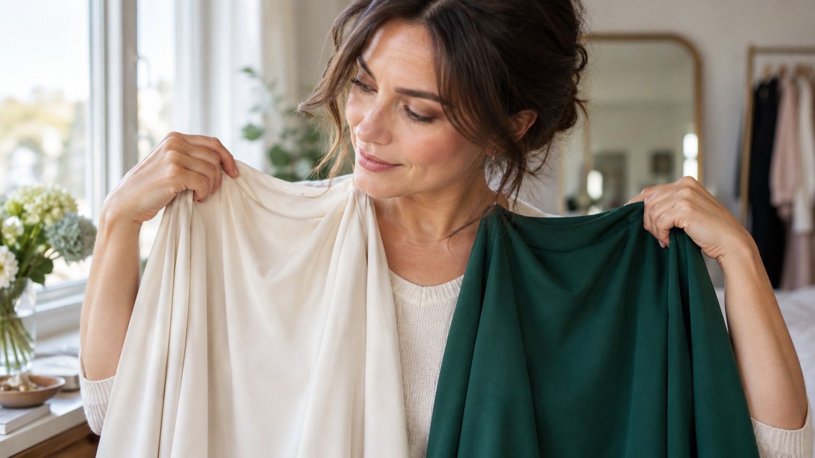
Try separating these decisions. In a window during daylight, hold a warm cream and a cool white near the jawline, then compare a clear pink with a muted rose. Cover your own clothes so their colours do not influence the test. The better option is rarely dramatic in the mirror; it often makes the complexion look calmer. If your attention keeps going to redness, under-eye shadows, or a yellow-green cast rather than to your features, that fabric is giving useful evidence.
| Quality to test | Two simple comparisons | What to watch for |
|---|---|---|
| Temperature | Ivory vs stark white; tomato red vs blue-red | Evenness around the nose and mouth |
| Value | Light denim vs ink navy; pale grey vs charcoal | Whether the face looks present or disappears |
| Chroma | Clear teal vs dusty teal; bright pink vs muted rose | Whether features look sharp or overwhelmed |
Why a what season am I quiz is only a first pass
A what season am I quiz can be a pleasant place to begin, especially if it asks about the colours that people already receive compliments in. But most quizzes rely on categories that are too blunt: “Do you have blue or brown eyes?” and “Does gold or silver suit you?” Lighting, hair dye, a tan, camera processing, and a preference for one metal can change every answer. A quiz may point toward Summer because someone reports ash-brown hair, while their best colours reveal a brighter, clearer Spring direction.
Use an online color season test as a hypothesis, not a verdict. Save its result, then test four to six fabrics that represent the suggested family. Take photos in the same indirect daylight with no filter and compare them later, when you are less invested in the answer. The test is useful if it makes you ask a sharper question: am I better in cool and soft colours, or merely better in low contrast? Those are not identical things.
Compare neighbouring seasons before choosing
Most uncertainty sits between neighbouring seasons. Light Spring and Light Summer can both wear pale colours, but Spring usually tolerates more warmth and brightness; Summer often looks more settled in blue-based, powdery versions. Soft Summer and Soft Autumn share muted chroma, yet the former generally improves with cool berry, dove grey, and soft navy, while the latter can take olive, warm taupe, and terracotta. Deep Autumn and Deep Winter both handle depth, but Autumn takes warmth in espresso and peacock, while Winter looks more alive in black, icy accents, and blue-red.
Make the comparison specific. Instead of trying “green,” compare a yellow olive, a blue pine, and a bright emerald. Instead of trying “pink,” put peach, muted rose, and fuchsia beside the face. A neighbour-season test works best with similar value and chroma, changing only one quality at a time. That prevents a deep warm red from competing unfairly with a pale cool pink. The aim is not to prove a theory; it is to find the side of the border that consistently gives the face more definition.
Read contrast in your own features, not in a chart
Contrast is the relationship among skin, hair, eyes, brows, and lips. Someone with very dark hair and clear skin may carry black-and-white outfits easily, but high contrast does not automatically mean Winter. A warm, deep person can still need rich autumn contrast rather than icy black. Equally, a fair person can be a deep season if their features have visual weight. Look at a bare-faced photo in neutral light and squint slightly: are the features blended and low-contrast, gently distinct, or immediately graphic?
Then repeat the test with clothing. If a high-contrast outfit makes the face look crisp rather than severe, it may be useful. If it creates a costume effect, soften the contrast with charcoal instead of black, cream instead of optic white, or a tonal outfit with one stronger accessory. This is one reason a palette should never become a list of paint-chip rules. Your best colours must still work with your desired level of drama, your hair colour now, and the context in which you dress.
Turn a season into a wardrobe tool
Once you have a likely direction, start with the colours closest to your face. A scarf, shirt, jumper, jacket lining, blush, or lipstick reveals more than trousers or shoes. Build a small test group: two neutrals, two everyday colours, one light shade, one dark shade, and one accent. Wear them repeatedly rather than judging them on a single good-skin day. A colour that survives tired mornings, indoor lighting, and an ordinary phone photo is much more useful than one that only works in a flattering mirror.
Keep the language flexible. You might conclude that you are “soft and cool, leaning Summer,” or “deep, warm, and comfortable borrowing from Autumn.” That is enough to guide purchases. If a supposedly wrong shade makes you happy and you can see that it works, keep it. Seasonal analysis is at its best when it helps you notice your own face with more accuracy, then gives you permission to leave the rest of the rack behind.