A color test for clothes is less dramatic than an online quiz suggests. It is a practical way to notice which colours support your face, which make every outfit harder to finish, and which deserve space in a wardrobe. The useful result is not a ban on half the colour wheel; it is a handful of dependable choices that make getting dressed less like solving a small emergency before breakfast.
Why clothing colour needs its own test
Clothes sit at different distances from the face and reflect light differently, so a colour that is lovely as a handbag can be tiring as a turtleneck. A lipstick is a concentrated spot of colour; a shirt fills the whole frame below the chin. Fabric changes the result too. Matte cotton, glossy satin, loose knitwear and rigid wool do not show the same navy or beige in the same way. That is why a general personal palette should be checked against actual garments rather than treated as an answer sheet.
The test also separates a colour you enjoy from a colour you can use repeatedly. A bright orange dress may be fun at a summer party, but it may not be the shade that works for work calls, a coat collar and five different trousers. A helpful wardrobe colour earns its place by combining easily and making your expression look rested in ordinary daylight. That is more valuable than a single flattering mirror moment under fitting-room lights.
Test shades where the neckline does the work
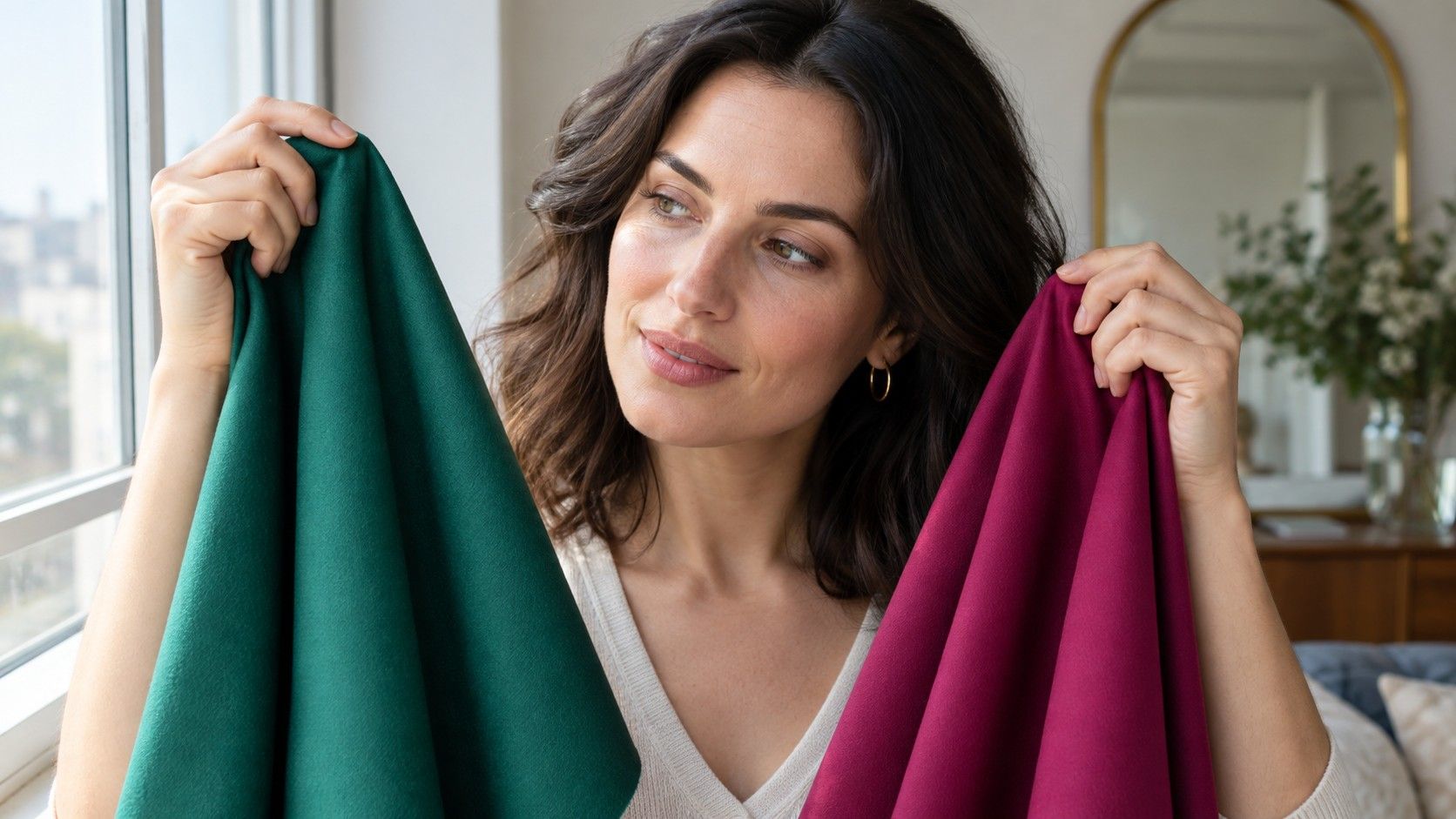
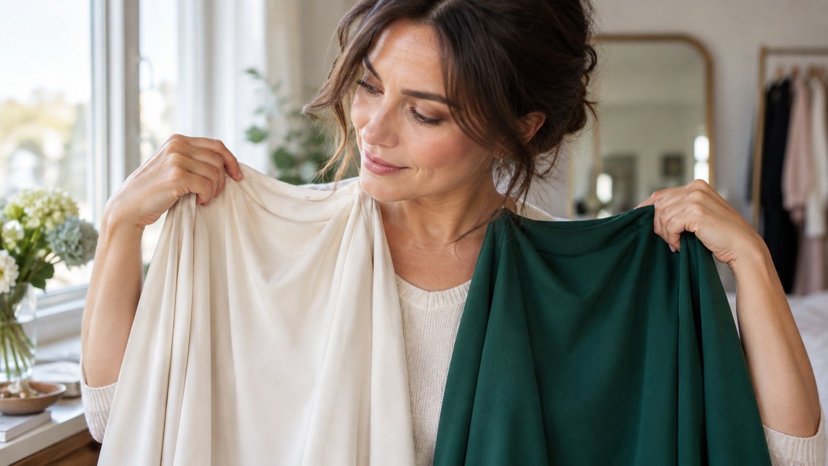
Start beside a window in indirect daylight. Pull hair away from the jaw for the first comparison, remove tinted glasses, and use little or no makeup if you can. Hold one top, scarf or fabric square directly beneath the chin. Look at the mouth, shadows under the eyes and the edge between face and neck. The colour that works usually lets the eyes, brows and lips stay visible. The weaker option can make redness, grey shadows or texture appear first, even when the garment itself is attractive.
Compare near-neighbours rather than a random pile: charcoal with black, ivory with optic white, berry with tomato red, sage with yellow olive. Take one photograph of each pair from the same place. The camera is not an infallible judge, but it helps when familiarity makes a favourite shade look better than it is. Limit the first session to ten or twelve pieces. A long colour test becomes noisy, and after too many comparisons the eye starts rewarding whichever top looks newest.
Choose three dependable wardrobe neutrals
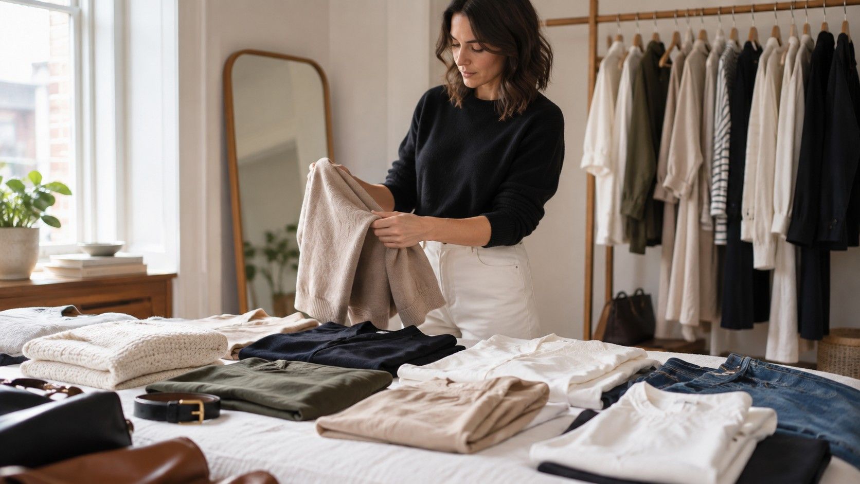
Most capsule wardrobes work better when the neutrals are decided first. Try to find one dark neutral, one light neutral and one middle neutral that can appear in jackets, trousers, shoes and bags. Black, charcoal, ink, espresso, soft white, stone, mushroom and olive can all do that job, but not for every face or every closet. The right dark neutral feels like definition; the wrong one can look like a frame placed over the face.
Lay likely neutrals beside one another before declaring victory. If your navy blazer fights with your chocolate boots and both only accept one kind of cream top, you do not have a practical base. The best choices allow several outfits without forcing every accent to match exactly. Consider season and fabric as well: a light stone linen trouser can work beautifully in summer while a similarly light wool coat may feel too pale beside your winter hair and skin. The palette should guide decisions, not erase context.
| Wardrobe question | Compare first | A promising result |
|---|---|---|
| Dark base colour | black, charcoal, ink, espresso | the face remains visible before the garment |
| Light layer | white, ivory, stone, pale grey | skin looks clear rather than drained |
| Everyday accent | muted and bright versions of blue, green or berry | eyes and lips look defined without extra makeup |
| Print scale | small blended print and bold high-contrast print | the pattern does not arrive before you do |
Use prints without losing the palette
Prints are where colour advice often becomes too strict. A floral top can include a shade that would be difficult as a solid because each colour occupies less space. What matters is the overall temperature, value and contrast. If your best colours are soft and low-contrast, a small watercolour-like print may be easier than sharp black-and-white geometry. If your features are naturally clear and dark, a bolder scale can feel more balanced. Stand a few steps back; the first impression matters more than the name of any tiny flower.
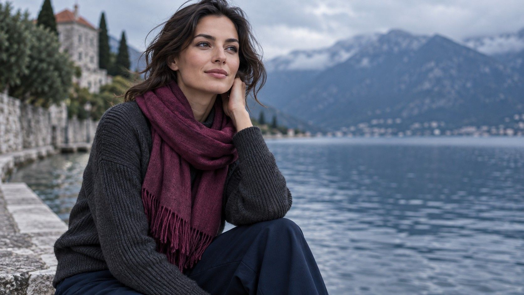
Check the print at the neckline, not only against trousers on a hanger. A pattern can look appealing in isolation but turn busy as soon as it reflects colour upward. Choose prints that repeat at least one of your dependable neutrals, then they will have more than one possible partner at home. Scarves are particularly revealing because they sit close to the cheeks. If a beautiful print makes you look tired, use it on a bag, skirt or lining rather than insisting it must become a face-framing signature.
Make fitting-room choices with a simple method
When shopping, take two nearby options into the changing room even if you think you know the winner. Hold each up by the face before looking at the cut, and photograph them in the same mirror if the lighting is not too strange. Ask whether the colour makes you look more awake without requiring a particular lipstick, tan or hairstyle. If it only works after a complicated rescue operation, it is not an easy wardrobe colour.
A what color clothes look best on me quiz can give you ideas, but it cannot replace this comparison because it cannot see the actual fabric, collar shape or light in the shop. Keep a small photo album of successful tops and a note with their colour names: smoky navy, blue-red, soft cream, muted teal. Bring it when shopping. A colour chart for clothes is most useful when it records your own evidence, not when it tries to make every retailer's shade fit a rigid category.
Let reliable colours make room for personal taste
After a few tests, you will probably see repetition. Certain blues, berries, greens or browns make sense with less effort. Build around those and leave room for colours that are simply enjoyable. A difficult shade can still work below the waist, in shoes, as a small accessory, or beside a reliable neutral. There is no prize for turning a wardrobe into a restricted paint box.
Recheck the results after a hair change, a new pair of glasses or a different season of life. Clothing colour is a relationship, not a permanent diagnosis. The practical goal is to own fewer pieces that need explaining and more that can be picked up half-awake, worn together, and trusted to make the person wearing them look like the main event.