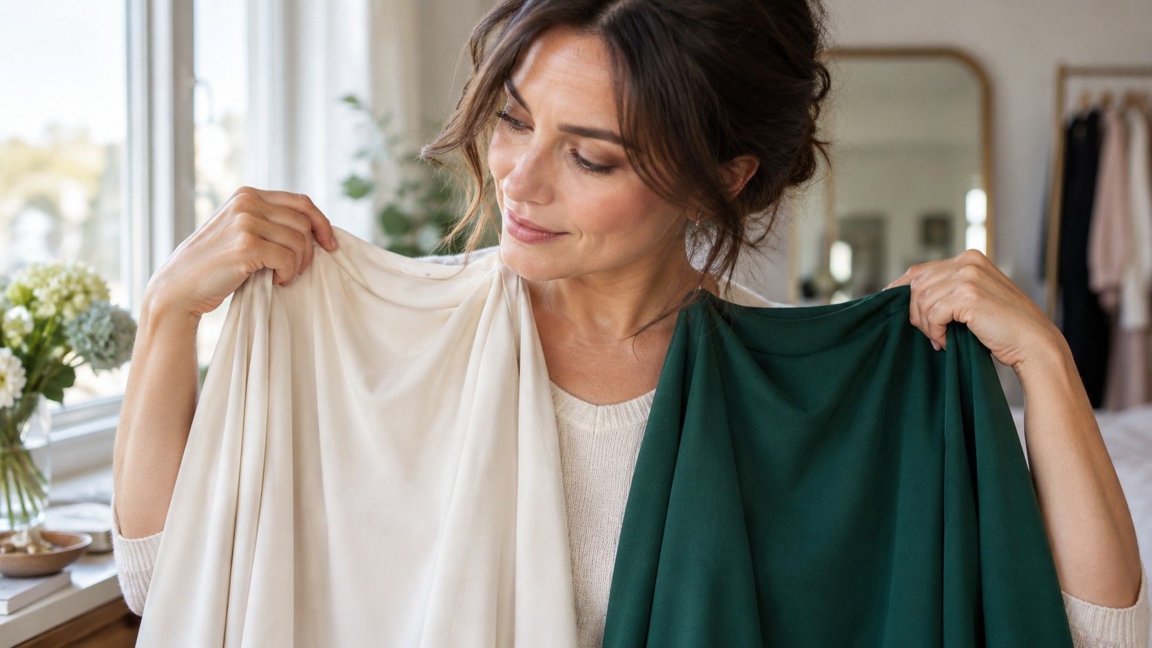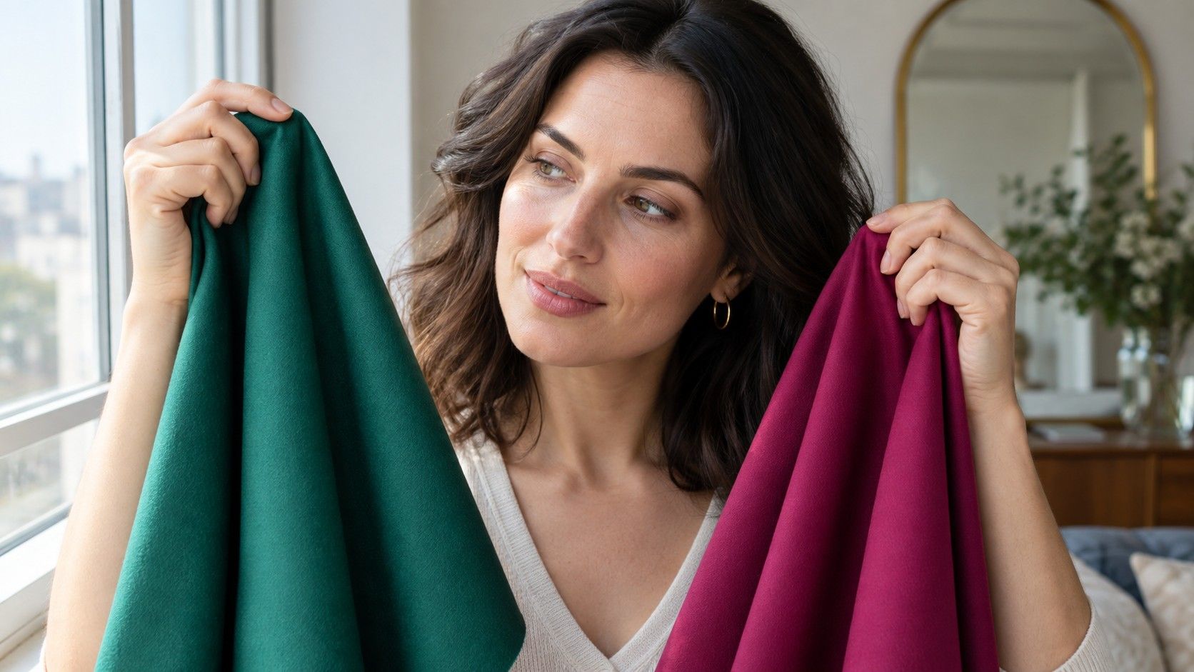
The question “what colors look good on me?” becomes easier once you stop judging a garment on the hanger. The useful test happens at the neckline, in plain daylight, when you can see whether a colour supports your face or asks your makeup, hair and lighting to rescue it.
What a flattering colour changes near the face
Flattering colors do not make a face unrecognisable. They make it easier to see what is already there. The skin often looks more even, the whites of the eyes are clearer, lips have enough definition and the line from cheek to jaw is visible without feeling harsh. A difficult colour can create the opposite effect: redness becomes the first thing you notice, shadows under the eyes deepen, or the mouth seems to disappear.
That response is not only about undertone. Face contrast matters too. Someone with dark brows, dark hair and clear eyes can often carry ink navy or strong black better than someone with pale brows, softly blended hair and low contrast. A high-contrast colour beside a low-contrast face can feel like the garment arrives before the person. Conversely, a very muted colour can make strong features look foggy rather than refined.
Watch the face in pieces. Does a top make the under-eye shadow stronger? Does it make the skin around the nose look redder? Do your eyes look sharper or simply more tired? These are more reliable questions than whether you personally like cobalt blue or have seen it styled beautifully on someone else. A favourite colour can still work lower in an outfit, away from the face.
Set up a comparison you can trust
Use daylight from a window, preferably indirect rather than a bright sunbeam. Stand facing the light with a bare or lightly made-up face and keep the same position as you swap colours. Mixed lighting is notorious for creating false winners: warm ceiling bulbs flatter beige, while a cool bathroom lamp can make white and grey appear crisper than they are outdoors.
You do not need special drapes. T-shirts, scarves, pillowcases, cardigans and even large sheets of paper are enough if the colour reaches the chin. Make a pair from the same family: cream and stark white, camel and cool taupe, coral and berry, olive and teal, charcoal and black. Hold one option under the face, look for ten seconds, then exchange it. The second colour is easier to judge because your eye has a real comparison.
Repeat on a second day before making any firm decision. One morning of poor sleep can change the apparent depth of shadows, and a new blush can make a warm shade look more convincing than it is. Photographing the same pairs can help you remember, but keep the phone’s filters and portrait enhancement off. The mirror gives the more useful immediate reading; the photo is only a second opinion.
Start with the colours you already wear
Open the part of your wardrobe that gets regular use and pull out six tops with different temperatures and depths. Include white, black, beige and one colour you receive compliments on. The goal is not to discover an entire seasonal palette in an hour. It is to notice the clothes you reach for because they make getting ready simpler, compared with the ones that need extra concealer, lipstick or a particular hairstyle.
White is a revealing first test. Bright optic white can bring clarity to cool or high-contrast colouring, while cream, oyster and soft ivory often sit more peacefully with warmth or lower contrast. Black behaves similarly. It can define features beautifully, but it can also throw a hard shadow under the chin and make the eye area look hollow. If black is a little severe, try charcoal, deep navy, espresso or aubergine before deciding you need to give up dark neutrals.
Beige deserves more precision than its reputation suggests. A yellow camel, pink-beige, mushroom taupe and sand can all be called beige, but they perform differently next to skin. Try them with the neckline exposed. The one that gives the face shape without pulling it toward yellow, grey or pink is a practical neutral worth remembering for coats, knitwear and shoes.
| Pair to compare | A likely useful clue | Next shade to try |
|---|---|---|
| Optic white / cream | Eye clarity and under-eye shadow | Oyster or soft white |
| Black / charcoal | Face contrast and jawline definition | Navy, espresso or aubergine |
| Camel / taupe | Yellowing versus even skin | Sand, mushroom or rosy beige |
| Coral / berry | Redness and lip definition | Muted rose or brick red |
Separate harmony from familiar habit
It is easy to mistake familiarity for harmony. Perhaps your school uniform made navy feel safe, or black is what every shop seems to sell. Habit answers “what do I usually wear?”; a colour test answers “what happens to my face when I wear it?” The two often overlap, but not always. A colour that feels like you can be a good emotional choice even if it is not your easiest near-face shade.
Try a small experiment with two similar outfits. Wear your usual black top one day, then a charcoal or dark teal top with the same trousers the next. Keep hair, glasses and makeup reasonably similar. Ask a trusted friend only which photo looks more rested, without telling them which one is your normal choice. If their answer matches your mirror observation, you have a useful signal rather than a passing mood.
Be wary of judging from a tiny colour sample. A berry lipstick may look excellent while a large berry sweater overwhelms you; a soft sage may work as a blouse but disappear in a printed dress with too little contrast. Scale, fabric sheen and neckline all change the result. Matte cotton shows colour plainly, while satin reflects surrounding light and can turn a balanced shade unexpectedly warm or cool.
Use undertone without letting it run the whole show
Undertone gives a helpful direction, especially when choosing reds, whites, beige and metal jewellery. Warm undertones frequently find peach, tomato red, warm ivory and golden olive easy to wear. Cool undertones often respond well to berry, blue-red, crisp white and blue-based teal. Neutral undertones can borrow from either side, especially in softened versions. These are starting points, not rules that override everything else.
Depth and clarity can matter just as much. A deep warm complexion may look better in rich rust than pale peach; a fair cool complexion may prefer smoky plum to bright magenta. If your colouring is muted, dusty colours often integrate better than neon versions of the same hue. If your features are clear and high contrast, muddy shades may make you look tired even when the temperature is technically right.
Hair colour can shift the balance. Fresh bright highlights can increase visible contrast, while a softer natural grey may make gentler shades feel more coherent. Glasses do the same thing because a dark frame creates a strong line around the eyes. Rather than trying to calculate every variable, test the colours while wearing your current hair and the glasses you actually use.
Build a short shopping rule from the result
After a few comparisons, write a rule that is short enough to use in a changing room. It might be: “Choose soft white over bright white, medium-dark neutrals over black, and berry or muted teal near the face.” Or: “Keep clear warm colours, avoid pale grey-beige, and use navy when black feels heavy.” A rule like this is more valuable than a long list of permitted colours because shops rarely offer the exact swatches from a palette chart.
Take a photograph of three reliable colours in daylight and keep it in your phone. When shopping, hold a candidate top under your chin near a window or step outside the fitting room. Check the same things each time: shadow, redness, eye clarity and whether the neckline makes your face look separate from the garment in a good way. If you need a full face of makeup to enjoy a colour, make that a deliberate styling choice rather than an everyday default.
Your answer to “what colors suit me?” can stay flexible. A colour that is not ideal at the neckline may be excellent in trousers, a bag, shoes or a patterned skirt. The aim is not a restricted wardrobe; it is a set of dependable colours that make the rest of your clothes easier to combine and your face easier to see.