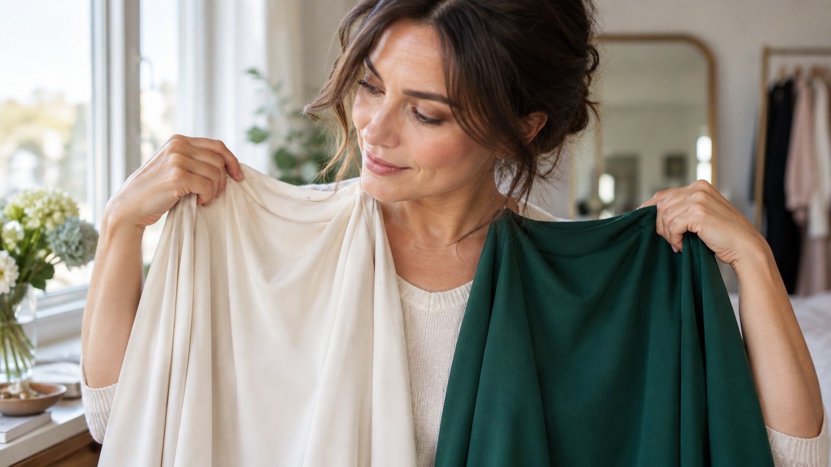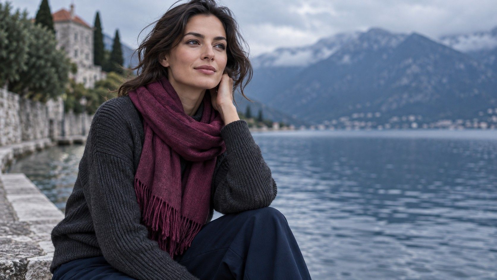
A Deep Summer color palette is useful for people who need depth near the face but do not come alive in the hard, warm drama often associated with very dark colours. Think cool, softened and substantial: charcoal rather than jet black, blackberry rather than orange-red, deep teal rather than bright turquoise.
Where Deep Summer sits in the seasonal system
Deep Summer is a practical description rather than a universally fixed category. In most seasonal systems it sits on the cool, muted side of Summer, borrowing more depth from the neighbouring darker palettes. The overall effect is not icy or pastel. It is quiet colour with enough weight to hold its own against dark hair, defined brows, deep eyes or medium-to-deep skin.
The three ideas work together. Cool means blue, rose or grey influence is usually easier than obvious yellow-orange warmth. Muted means colours look slightly smoked, softened or complex rather than fluorescent. Depth means pale, chalky shades may lack presence at the neckline. A person can share one or two of these qualities without needing every item in a Deep Summer wardrobe.
In real life, a person often notices the pattern before knowing the label. Black may be wearable but severe; pale dove grey may be pleasant but too weak; a softened navy or deep berry suddenly makes the whole face look more coherent. Those observations are more useful than trying to decide whether a celebrity photo proves your exact season.
The colours that show depth without black
Charcoal is one of the most dependable Deep Summer neutrals. It gives the structure of black but carries less sharp contrast, especially in matte wool, cotton jersey or knitwear. Blue-black can work too, provided it reads navy in daylight rather than inky brown. Deep navy, graphite, cool espresso and a dark cool taupe are useful alternatives for coats, trousers and jackets.
For colour, look for blackberry, mulberry, plum, wine, blue-red, smoky raspberry, deep rose, peacock teal, petrol blue and softened pine. The common thread is not darkness alone; it is a greyed or blue-based undertone. A bright royal blue may be too clear, while a dusty deep blue feels more integrated. A rusty burgundy can be too warm, while a cool berry red gives the lips and eyes definition without bringing redness forward.
Light colours still have a place, but they usually need softness and a little depth. Try dusty mauve, soft white, cool mushroom, muted blue-grey and softened lavender rather than stark white, lemon, peach or warm camel. Hold them under the chin. If a light shade makes the face recede, use it as a lower-half colour or combine it with a deeper scarf, neckline or earring.
| Instead of | Try | Why it often works |
|---|---|---|
| Jet black | Charcoal or blue-black | Retains depth with less severe shadow |
| Bright scarlet | Blackberry or blue-red | Keeps coolness and soft definition |
| Warm camel | Cool taupe or mushroom | Acts as a calmer cool neutral |
| Electric turquoise | Petrol or smoky teal | Adds colour without excessive clarity |
Deep Summer versus Soft Summer
Soft Summer and Deep Summer share cool muted colors, so the overlap can be confusing. Soft Summer usually needs less contrast and can look especially at home in dusty rose, sage, soft navy and blue-grey. Deep Summer can borrow those shades, but it generally needs them a little darker or more substantial near the face. A pale soft-grey blouse may look elegant on one person and leave another looking unfinished until charcoal or berry is added.
Test depth before assuming the difference is about how dark your hair looks. Place a soft medium blue-grey, a deep smoky navy and a clear bright cobalt by the face. If blue-grey is pleasant but weak, smoky navy is balanced and cobalt feels loud, deeper Summer may be the helpful direction. If both navy and cobalt feel heavy while blue-grey brings out the eyes, Soft Summer may be closer.
Contrast matters inside an outfit as well. A Deep Summer can often manage a charcoal jacket over a muted mauve top, or navy with cool taupe, because the value change has enough presence without turning stark. Soft Summer may prefer closer values, such as blue-grey with smoky rose. There is no need to turn this into a strict rule; use the mirror to decide whether the outfit frames the face or competes with it.
Choose makeup and metals with the same logic
Makeup often looks most natural when it repeats the palette’s cool, muted depth. Berry, rose-plum and soft wine lip colours tend to give definition without the orange cast of warm brick shades. For blush, look for muted rose, cool berry or plum-rose rather than bright coral. The right shade should make the complexion appear more even, not announce itself before the rest of the face.
Eye makeup can stay in charcoal, cool taupe, slate, smoky navy, muted plum and pewter. A full black line may be effective for an evening look, but a softened charcoal pencil often gives more believable day-to-day definition. Very golden bronze, orange copper and high-shine yellow gold can pull the eye area warm; that may be intentional for a styled look, but it is not usually the easiest match for this palette.
Silver, white gold, platinum and pewter jewellery generally echo the cool neutral quality. Oxidised silver and softened pearl are especially useful when polished bright metal feels too crisp. Yellow gold is not automatically impossible: cooler skin can still wear it when the piece is small, mixed with silver, or set beside a deep berry or navy neckline. The test is whether the metal brings life to the face, not whether a chart permits it.
Create outfits from a small Deep Summer palette
Start with three dark neutrals: charcoal, navy and cool espresso or deep taupe. Add two lighter bridges such as soft white and mushroom. Then choose three colours you will genuinely wear: blackberry, smoky teal and muted rose are a strong starting group. This small set produces more combinations than a large list of swatches because every item has a similar level of coolness and softness.
For work, try charcoal trousers with a muted berry knit, or navy with a soft white shirt and pewter earrings. For a casual outfit, deep denim with smoky teal and a cool taupe jacket gives depth without a black-and-white contrast. When a single deep colour feels heavy, break it with a softer neutral near the face. A navy coat over a muted rose scarf can be easier than navy alone.
Prints work when their colours remain related: charcoal, plum, dusty blue and soft white in a small or medium-scale pattern are usually easier than a print mixing bright lime, orange and pure black. Fabric finish matters as well. Matte and softly textured materials preserve the palette’s muted contrast, while very glossy satin can make even a good colour look sharper than expected.
Use the palette as a test, not a restriction
The most useful Deep Summer color palette is a shortlist of dependable near-face choices, not a ban on everything warm or bright. Keep a small set of comparison drapes—charcoal, navy, cool taupe, berry, smoky teal and soft white—and use them in daylight when you are unsure. Observe shadow beneath the eyes, redness around the nose and whether the eye colour becomes clearer.
Hair colour, glasses and makeup can change the amount of depth you need. Fresh bright highlights may make a clearer blue feel easier; a new dark frame may let you carry more contrast. The underlying preference for cool, softened colour may remain, but your practical range can expand. A palette earns its place when it makes dressing simpler, not when it forces every purchase to match a season name.