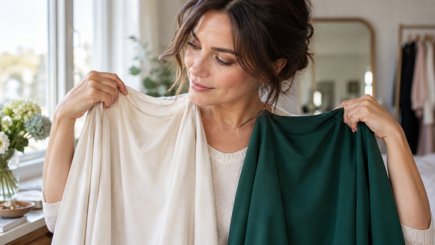
A capsule wardrobe color palette should make a rail of clothes easier to use, not turn it into a carefully numbered craft project. The best palettes are built from garments that already earn their keep: the jacket you reach for, trousers that work with several tops, the colour that makes you look awake without special lighting. Start there, then add enough structure to stop the almost-matching purchases that quietly make a wardrobe feel larger and less useful at the same time.
Start with the clothes that already work
Before choosing colours on a screen, pull out the pieces you wear repeatedly. Put them on a bed or photograph them in daylight and look for the quiet pattern. Perhaps your reliable clothes are mostly ink navy, soft white, olive and berry; perhaps they are espresso, cream, dark teal and rust. Do not begin with clothes you keep because they were expensive or because they might become useful on a different version of your life. A capsule needs evidence, and wear marks are unusually honest evidence.
Notice why the favourites work. Some are useful because the colour sits well near the face; others are merely excellent trousers that can tolerate more flexibility. Fabric and finish matter. A faded cotton navy, a sharp navy poplin and a glossy navy skirt may not cooperate as easily as their labels imply. Also check the setting: a coat that works in winter may be too dark against summer skin, while pale linen can look right in July and oddly weak in a heavy November outfit. A personal color palette for clothes has to survive these ordinary changes.
Choose a base palette before accents
Most effective capsules start with three to five base colours: a dark neutral, a light neutral and one or two middle tones. The names are less important than the relationships. Black may be a brilliant dark base for someone with clear, high-contrast features, while charcoal, ink, espresso or deep olive may be more forgiving for another person. Light bases can be optic white, soft white, ivory, stone or pale grey. Middle tones are often where a palette begins to feel personal: mushroom, denim blue, warm taupe, sage or cocoa.
Put the likely bases next to each other. If every combination asks for one precise scarf to make sense, they are not a dependable foundation. A good set creates several calm pairings without exact colour matching. This is why a capsule wardrobe colour palette is usually easier when it has a clear temperature direction, even if it is not strict. Cool navy, grey and soft white share an underlying logic; warm brown, cream and olive do too. Neutral palettes can mix directions, but they benefit from repeated depth and fabric texture rather than vague promises that everything is versatile.
| Palette role | What it should do | Examples to test |
|---|---|---|
| Dark base | anchor coats, trousers, shoes and bags | ink, charcoal, espresso, deep olive |
| Light base | brighten shirts and close-to-face layers | soft white, ivory, stone, pale grey |
| Middle neutral | bridge light and dark without looking flat | mushroom, denim, taupe, cocoa |
| Accent | add variety while pairing with two bases | berry, teal, rust, clear blue, soft pink |
Give every colour a mixing partner
A colour earns a place in a capsule when it can form at least three outfits, not when it looks impressive on its own. For each proposed accent, lay it beside your dark base, light base and one middle tone. A muted raspberry top may work with charcoal trousers, soft-white jeans and a navy skirt; a bright lime shirt may only work with one pair of jeans and a brave mood. That does not make lime a bad colour. It makes it a specialist rather than a foundation piece.
Use a simple outfit formula while checking: one base near the face, one base below the waist, then an accent or a texture. Photograph the combinations on a hanger and, more importantly, wear a few of them. Some pairs look polished in a flat lay but feel mismatched once skin, hair and shoes join the picture. Patterns deserve the same test. A print can act as an accent if it repeats two of your bases, while a print containing five unrelated colours tends to demand an entire supporting cast of garments.
Use seasonal colour without making the wardrobe disposable
Seasonal accents keep a capsule from becoming a uniform, but they do not need to replace the core each spring and autumn. Let the base palette stay steady and vary smaller, easier pieces: a rust knit, a pale blue shirt, a berry scarf, a green bag or a patterned skirt. This lets you enjoy current colour without leaving a lonely garment behind when the weather changes. It also makes shopping calmer because the question becomes whether the new shade has partners, not whether it is the colour of the month.
Think about weight as well as hue. A warm terracotta may be excellent in brushed wool and too heavy in a summer poplin blouse; dusty blue can feel right in denim but cold in a shiny evening top. If your personal colour analysis suggests that a seasonal shade is not ideal at the neckline, place it farther from the face in trousers, shoes or a bag. A palette is a tool for arranging clothes, not a reason to reject every colour you enjoy.
Test the palette with real outfits before buying more
Build a small trial capsule from what you own: two bottoms, three tops, one layering piece, one outer layer and shoes. Aim for ten or more combinations without forcing yourself to wear every item with every other item. Take quick daylight photographs over a week. The test reveals practical details that a colour board cannot: whether the dark base is too severe with a pale top, whether two neutrals only work in theory, and whether the accent is doing useful work or simply asking for attention.
Check close-to-face outfits in the mirror after a normal morning, not at the height of a fresh fitting-room enthusiasm. If a top requires a specific lipstick to stop you looking tired, record that. It might still be worth keeping, but it is not as flexible as a core colour. Likewise, if a neutral makes your face look clear regardless of makeup and hair, it has earned a central role. The point is to discover a reliable hierarchy rather than to pretend all shades are equally easy.
Turn the results into a restrained shopping list
Once the test is complete, write a short list of actual gaps. Instead of 'more colour', try 'a soft-white shirt that works with ink and olive' or 'a muted berry knit that pairs with charcoal and denim'. This phrasing turns a capsule wardrobe color palette into a filter for purchases. It also stops duplication: three almost identical dark blue tops are not automatically useful if they occupy the same outfit role.
Leave a little empty space in the system. A flexible capsule can accept a sentimental colour, a vivid holiday piece or an experimental print because its foundations are doing their job. Revisit the palette after a change in hair colour, climate, work routine or taste. The goal is not to finish the wardrobe forever. It is to keep a small group of colours that mix honestly, make the morning quicker, and let each new item prove it belongs before it takes up a hanger.