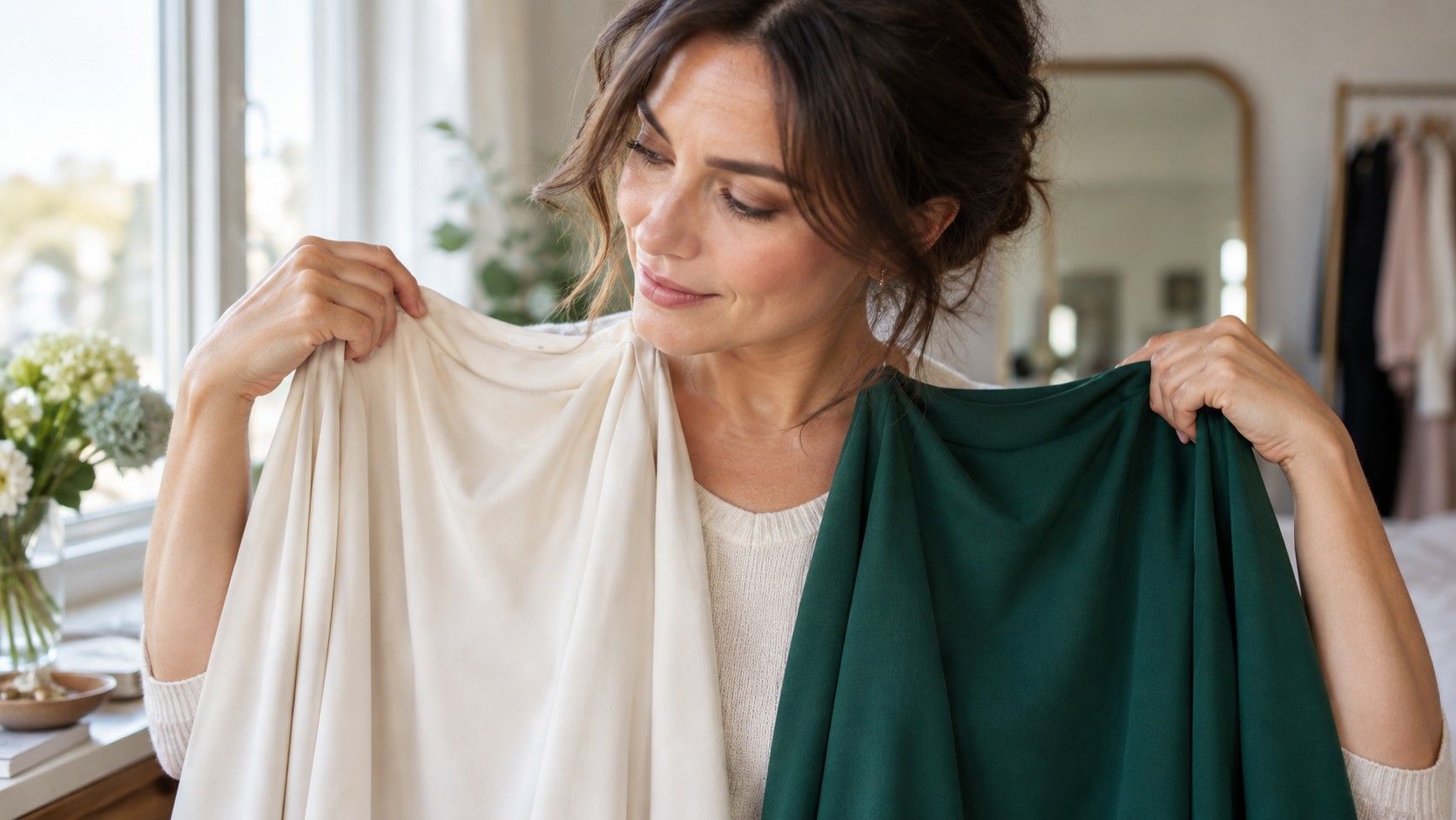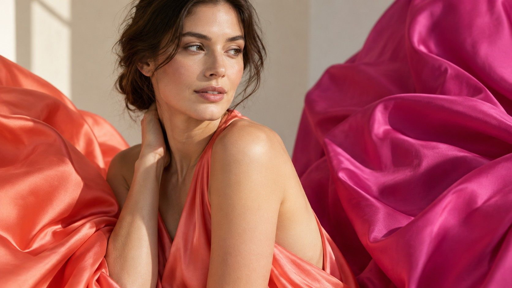
Warm vs cool colors sounds like a lesson from a paint box, yet it becomes much clearer when two almost identical shirts are held near a real face. One red leans toward yellow and coral; another leans toward blue and raspberry. One white is creamy, another looks sharp and icy. Learning to see those quiet differences makes colour shopping more logical, but it works best when you treat temperature as one clue alongside value, intensity and contrast.
What makes a colour look warm or cool
Warm colours tend to show a yellow, orange or golden influence. Think coral, tomato red, marigold, camel, moss and warm chocolate. Cool colours tend to lean blue, pink, violet or grey: fuchsia, blue-red, icy pink, cobalt, blue-grey and charcoal. Neutral colors sit closer to the middle, although they can still have a warm or cool bias. Beige may be golden or rosy; navy can feel almost black-blue or slightly softened with grey.
Temperature is relative, which prevents a lot of confusion. A cool yellow is still yellow, but it may look greener or clearer next to a buttery, orange-leaning yellow. A warm blue may have a touch of green, while a cool blue may lean violet. This is why warm colors vs cool colors are easier to understand in pairs. Looking at a single garment under artificial light asks the brain to guess; comparing neighbours gives it something concrete to notice.
Why names on labels are not enough
Retail names are imaginative, not diagnostic. A label saying berry, ivory, stone or rose can describe several different temperatures depending on the brand and fabric. Even colours with obvious names vary: coral can be muted and pinkish or loud and orange; fuchsia can be blue-based or softened with warmth. Online product photography adds another complication, because white balance, filters and phone screens move the colour before the package reaches you.
Use the name only as a starting point. Put suspected warm and cool versions together under daylight, or compare the item with something you already know suits you. If you own a blue-red lipstick that reliably makes your face look clear, it is a useful reference against a new red top. If soft ivory works better than optic white, use it when testing pale beige shirts. Personal references are more reliable than trying to memorise a universal colour chart while standing under retail spotlights.
Compare near-neighbour shades under daylight
A simple warm vs cool undertone test uses pairs that differ mainly in temperature. Hold cool pink and peach below the chin, then blue-red and tomato red, then soft grey and camel. Work by a window in indirect light, with hair pulled back and minimal tinted makeup. Watch the skin around the nose and mouth, the under-eye area, and whether the eyes remain visible. A harmonious colour often makes the face look smoother and more awake; the competing one can make redness or shadows appear before you notice anything else.
Do not rush from one pair to a final label. Someone can look good in cool raspberry and still prefer warm olive to a very icy mint because depth or chroma matters more in that comparison. Photograph the pairs from the same position and return to them later. The useful question is not whether warm or cool is universally better. It is which temperature direction makes your particular features look more settled when the colours are equally light, dark, bright or muted.
| Colour family | Often warmer | Often cooler |
|---|---|---|
| Red | tomato, brick, coral red | raspberry, cherry, blue-red |
| Pink | peach, salmon, warm rose | fuchsia, icy pink, mauve |
| White and beige | ivory, cream, golden beige | optic white, dove grey, rosy taupe |
| Blue and green | teal, turquoise, yellow olive | cobalt, periwinkle, blue spruce |
Match temperature to undertone with care
Undertone is the temperature tendency in your colouring, not the same thing as skin depth. Fair skin can be warm, cool or neutral; deep skin can be warm, cool or neutral too. Vein colour, jewellery tests and sun response are often presented as shortcuts, but each can mislead. Veins are affected by skin thickness and light, gold and silver come in many finishes, and tanning is not a reliable map of undertone. Fabric comparisons around the face provide more useful evidence.
If warm colours repeatedly make the complexion look yellow or uneven, try cooler versions. If cool shades make it look grey or disconnected, test warmer ones. If both groups have winners, you may have a neutral undertone or you may be choosing different values and chroma levels without noticing. Keep the verdict modest. A good palette can contain a warm brown, a cool navy and a neutral berry if each does a different job and supports the overall contrast of the face.
Let contrast and intensity overrule a rigid rule
Temperature is only one axis. A person with clear eyes, dark hair and strong brows may need enough contrast to keep black-and-white or a saturated jewel tone from overwhelming the face. Another person with soft brows, blended hair colour and gentle features may look better in smoky versions even if both people share a cool undertone. In the same way, a warm coral can be too bright while a muted terracotta looks excellent. Calling both warm does not make them interchangeable.
Test outfits as combinations. A cool person can wear a warm camel coat more easily with a cool berry scarf near the face; a warm person can wear a cool cobalt trouser because it is farther from the cheeks. Prints can bridge temperatures when their overall effect is harmonious. The closer and larger the colour is to the face, the more important the comparison becomes. This gives you flexibility without pretending that every colour works equally well in every placement.
Use the difference in daily wardrobe decisions
Once you can spot the warm or cool direction, build a short reference list instead of memorising rules. Record your best white, dark neutral, red, pink and blue with an ordinary description: cream rather than optic white, smoky navy rather than black-blue, raspberry rather than tomato. Photograph those items in daylight. The reference helps when a retailer calls four unrelated shades of beige by the same name and when an online image cannot be trusted.
Keep favourite exceptions. A colour that is slightly outside your ideal temperature can work in a bag, trousers, shoes or a small print, and some days personal taste matters more than optimisation. The point of learning how to tell warm and cool colors is not to police a wardrobe. It is to recognise why two nearly identical options feel different, choose the one that asks less work from your face, and save the other for a place where its warmth or coolness can be enjoyed without taking over.