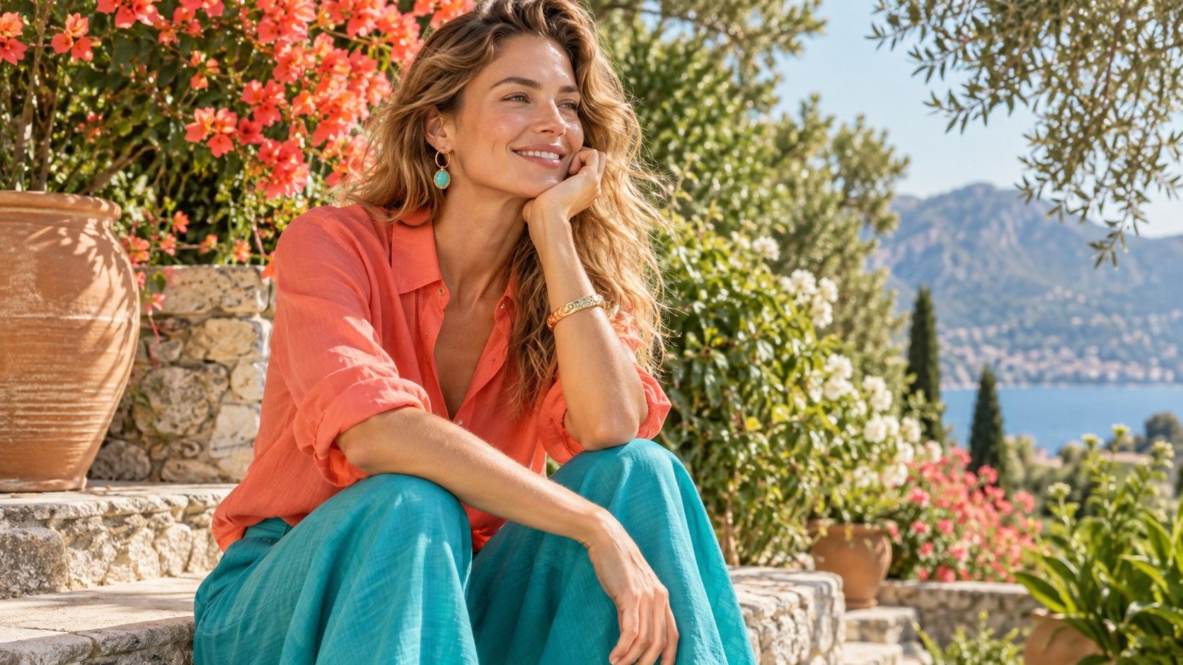
A True Spring color palette is built around colour that is warm, clean and lively rather than dark, dusty or icy. The aim is not to wear every bright shade at once. It is to find colours that give the face clarity without making it look overpowered: coral instead of wine, turquoise instead of smoky teal, warm cream instead of greyed beige.
What makes True Spring distinct
True Spring sits in the warmest, clearest part of the Spring family. Warmth is usually visible first: golden, peach, apricot, leaf-green and yellow-based reds tend to feel more natural than blue-red berry or icy pink. Clarity matters just as much. A True Spring face can often carry colour that looks fresh and clean, while heavily greyed or muddy shades make the skin appear tired.
This does not mean that every True Spring is light-haired, fair-skinned or drawn to neon. Colouring can be fair, medium or deep; hair can be blonde, brown, red or dark. The shared pattern is the response to warm clear colors at the face. A clear coral may make the eyes and lips look defined, while a muted mauve can seem to put a grey veil over the complexion. The test is always the effect, not a checklist of features.
Brightness is often misunderstood as maximum intensity. True Spring usually needs colours that are clean, not necessarily fluorescent. A bright warm green can be easier than a murky olive, but lime highlighter yellow can still overwhelm the face. Think of a sunlit fruit market rather than a highlighter pen: ripe peach, fresh leaf green, aqua, warm pink and clear tomato red all have life without needing to shout.
The warm bright shades to compare first
Start with two pairs that reveal temperature. Compare coral with a cool berry red, then warm turquoise with a smoky blue-teal. In indirect daylight, coral often brings warmth and softness to a True Spring mouth and cheeks; berry can make the skin look cooler or more uneven. Warm turquoise has a slight yellow or green lift, while a smoky teal carries more grey and blue. The better shade usually makes the whites of the eyes look clearer without deepening under-eye shadow.
Then compare peach or apricot with dusty rose, and grass or apple green with khaki. Peach should look fresh rather than childish; if it turns the face yellow, it may be too pale or too orange rather than proof that all warmth is wrong. Clear green can be surprisingly useful near the face, especially when it has enough yellow. A dull military olive often belongs better in trousers or a bag because its grey-brown cast can flatten Spring brightness.
Use large pieces of fabric, not a lipstick cap or a tiny paper swatch. A scarf, knit or folded T-shirt reflects enough colour up to the jawline to reveal redness, shadow and eye clarity. Keep hair and makeup similar for each comparison. It is easy to call a shade flattering because it matches a favourite handbag; the question is whether the face looks alive when the fabric is held under the chin.
| If this feels heavy or dull | Compare it with | What to observe |
|---|---|---|
| Wine or blue-red berry | Coral or tomato red | Whether lips and cheeks look warmer and clearer |
| Charcoal or black | Warm navy or deep teal | Shadow under the eyes and jawline contrast |
| Cool grey-beige | Camel or warm ivory | Whether skin looks grey or softly even |
| Smoky teal | Warm turquoise or aqua | Eye clarity without a blue cast |
True Spring versus Warm Autumn
True Spring and Warm Autumn share a warm undertone, so both may enjoy coral, camel, yellow gold and warm green. The difference is usually clarity. Warm Autumn is more at home in rich, earthy and softened colours: rust, moss, cinnamon, petrol and deep olive. True Spring tends to look fresher in the clearer versions: tomato red, leaf green, warm turquoise, apricot and a cleaner camel.
Try a direct test instead of arguing with a palette chart. Hold a bright warm coral and a burnt terracotta near your face, then an apple green and a moss green. If the earthy colours give welcome depth but the clear colours make the eyes look much brighter, Spring may be the more useful direction. If clear coral looks too vivid while rust blends into the skin with ease, Warm Autumn may explain your colouring better.
Depth can blur the distinction. A person with dark hair or deep skin may need more substantial True Spring colours such as warm navy, emerald-leaning green, deep turquoise and dark coral. That does not automatically make the palette Autumn. Look for the degree of grey and brown the face tolerates. Spring usually needs the colour to stay clean even when it becomes darker.
Find neutrals that do not look dull
Neutrals are where many True Spring wardrobes lose their energy. Pure black can cast a heavy shadow and cool grey can make the skin look drained, yet an outfit made entirely of coral and aqua is not always practical. Warm ivory, cream, oatmeal, light camel, tan, golden beige and warm navy provide a calmer base while keeping the palette’s warmth intact.
White is worth testing carefully. Stark optic white can be too cool and sharp, while a very yellow cream can appear muddy. Look for warm white, vanilla, soft ivory or a clean ecru. Put each one beneath the face beside a coral scarf or gold earring. The right light neutral should make that accent look intentional and keep the face bright, rather than turning it into the only colour you can see.
For darker pieces, try warm navy, chocolate with a little red warmth, deep teal or clear dark olive before defaulting to black. A warm navy blazer can offer the usefulness of a dark neutral without swallowing the colour of the lips. If you love black, keep it away from the neckline with a warm scarf, a bright earring or an open jacket over a cream top. Style can expand a palette without pretending every shade gives the same effect.
Use makeup and gold with the same logic
Makeup tends to look most coherent when it repeats the palette’s warmth and clarity. Lip colours in warm coral, salmon, peach-pink, watermelon and tomato red are often easier than blue-based raspberry or plum. The goal is not orange lipstick for its own sake. A good shade gives the mouth definition and makes the complexion look even; a too-warm shade can make teeth look yellow or compete with a naturally rosy face.
For cheeks, try apricot, warm peach or clear warm pink. Brown contour products need care because grey-brown contour can make a Spring face look hollow. A gentle warm bronzer or a peachy blush often gives a more natural shape. Eyeshadow can stay in warm champagne, light gold, camel, peach, warm olive or clear teal accents rather than heavy charcoal and cool slate.
Gold jewellery usually echoes the undertone gracefully, especially yellow gold, warm brushed gold and pearls with a cream cast. Rose gold can work when it is not too muted. Silver is not forbidden, but bright cool silver may look disconnected unless it is paired with turquoise, warm pink or a very clear outfit. Hold jewellery at the jawline in daylight; the winning metal tends to make the skin look lit from within rather than simply more reflective.
Build outfits with colour and breathing room
A small True Spring wardrobe can begin with cream, camel, warm navy and tan as foundations. Add three clear colours that you actually want to wear: coral, warm turquoise and leaf green are a practical group. Then choose one or two accents, perhaps sunny yellow, warm pink or clear red. These shades combine more easily than a giant list of approved swatches because they share warmth and a clean finish.
For work, warm navy trousers with a cream shirt and coral earrings create contrast without black-and-white severity. A camel jacket over warm turquoise can look polished if the fabrics are matte and the colours remain clear. For casual outfits, light denim with a leaf-green knit or a coral T-shirt gives the face a reliable lift. Keep one area calm if you use a vivid top: cream trousers, tan shoes or a simple gold hoop let the colour breathe.
Prints are often easier when the background is cream or warm navy and the colours remain distinct: coral, aqua, green and warm pink can work together without turning murky. Very dusty florals, grey leopard prints and dark brown checks may be attractive on the rail but can dull the face from a distance. In a fitting room, step toward a window and check whether you see your expression before you see the print.
Let the palette guide, not restrict, your choices
The best colors for True Spring are the ones that repeatedly make you look awake in ordinary daylight. Keep a short record of useful comparisons: coral over berry, ivory over cool grey, turquoise over smoky teal, warm navy over black. Use those anchors when shopping rather than chasing a perfect seasonal label.
A colour that is less ideal at the neckline can still be excellent in shoes, denim, a bag or a patterned skirt. Hair colour, glasses and makeup can also shift how much contrast you enjoy. The point of a True Spring color palette is not to narrow your wardrobe. It is to make each purchase easier to judge and to keep the warm, clear qualities that already make your features feel present.