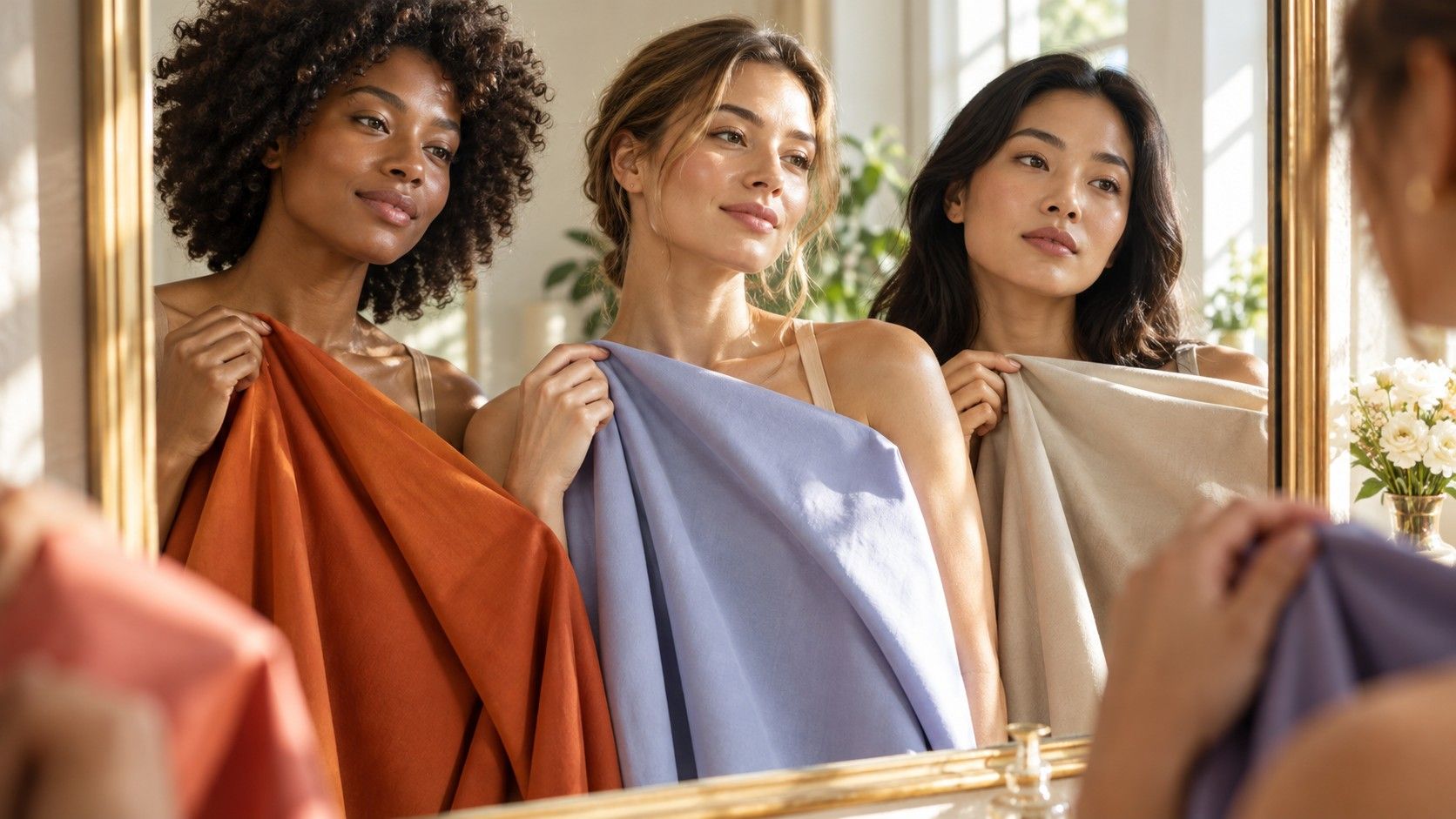
A skin tone chart can be a helpful visual reference, provided it is treated as a map rather than a verdict. It can show why “beige” is too vague for a foundation search, or why two people at a similar depth can need very different clothing colours. It cannot capture the way your skin changes between a north-facing window, a sunny pavement, and a bathroom mirror. The useful part is learning what a chart is actually trying to organise.
What a skin tone chart is useful for
Most charts arrange skin by visible depth, moving from fair through light, medium, tan, and deep. This is useful for narrowing a foundation range and for understanding contrast in clothing. A very light lilac can look delicate beside fair skin yet disappear beside deep skin; the same person may still have either a warm or a cool undertone. A skin color chart gives a starting point for these comparisons, not a precise match for an individual face.
The names on a chart are usually broad retail terms. “Ivory,” “sand,” “honey,” “caramel,” and “espresso” are memorable, but they are not shared standards. One brand’s sand may be another brand’s warm beige; one range calls a shade neutral while another calls it olive. Use chart names to describe direction and depth, then make the final choice against the jawline and neck in daylight.
Why depth names change from one chart to another
Fair, medium, and deep sound objective, but the borders are flexible. A person who is light-medium in winter may be medium after summer; freckles and facial redness can make the face appear deeper or warmer than the neck. Brand shade ranges also have commercial gaps. A label may offer six “medium” shades that differ more in undertone than in depth, leaving a person to decide from a name rather than a usable comparison.
It helps to think in neighbours rather than in a single point. If you usually wear a light-medium foundation, compare one adjacent lighter and one adjacent deeper shade under the same light. A good match will not necessarily look perfect on the back of the hand, which is often a different colour from the face and neck. The best depth is the one that blends across the jawline after the product has settled, even if the bottle name sounds less familiar than expected.
| Chart layer | What it describes | How to use it |
|---|---|---|
| Depth | How light or deep the surface skin appears | Choose three nearby foundation depths |
| Undertone | Warm, cool, neutral, or olive cast beneath the surface | Compare the casts at the jawline and neck |
| Contrast | Difference among skin, hair, eyes, and brows | Adjust outfit light-dark contrast |
| Chroma | How clear or muted a colour looks | Test bright colours against softened versions |
Add undertone before the chart becomes practical
Depth alone does not explain why a pale peach base can look orange on one fair person and harmonious on another. Undertone adds that missing layer. Warm undertones may suit golden, peach, yellow, or warm-red casts. Cool undertones tend to tolerate pink, rosy, or blue-based shades. Neutral undertones can often borrow in both directions. Olive undertones may include a muted yellow-green or grey quality and can be misread as either warm or cool when a chart offers too few choices.
Do not decide undertone by one rule. Look at the skin around the jaw, neck, and upper chest in indirect daylight. Compare ivory with crisp white, warm coral with cool berry, and camel with grey taupe. The more helpful colour often makes the complexion look even and lets the eyes remain visible. If standard warm shades go orange and standard cool shades go pink, add neutral and olive to the comparison instead of repeatedly buying a deeper or lighter mismatch.
Avoid turning chart labels into a strict identity
A skin tones chart is not a measurement of beauty, health, or belonging. Its categories have limits because human skin has translucency, freckles, redness, pigmentation, texture, and reflected light. A person can be fair with an olive undertone, deep with a cool undertone, or medium with a neutral undertone that changes how colours read across the face. The chart is there to make product and colour language less vague, not to make anyone fit a narrow visual category.
This matters when clothing advice becomes too prescriptive. “Warm skin cannot wear silver” and “cool skin cannot wear orange” are tidy statements that fail in real wardrobes. A warm person may love a burnished silver finish; a cool person may wear a muted rust that is deep enough and soft enough to work. Instead of banning a family, look for the temperature, value, and saturation within it. There is more than one orange and more than one grey.
Use colour comparisons beyond a skin chart
A chart is most useful when it leads to real-world comparisons. Near the face, test a warm white and a cool white, then a clear colour and a muted version of the same family. If black looks heavy, compare charcoal, espresso, and ink navy before concluding that dark colours are wrong. If beige makes the face vanish, try mushroom, olive taupe, stone, or a richer camel. Each comparison tells you something the flat swatches cannot: how the colour behaves beside your particular eyes, lips, and hair.
For makeup, keep the test just as concrete. Swatch foundation from cheek to neck, wait for oxidation, and view it from a normal conversation distance. Compare blush on bare skin near the cheekbone, not only on the wrist. For lipstick, notice whether the shade makes the teeth appear less bright or pulls focus to redness around the mouth. These small checks make a chart useful without giving it more authority than it deserves.
Build a personal reference that remains useful
Make a small record of colours that consistently work: the exact foundation shade after it dries, the navy that is better than black, the berry that beats bright coral, the pale neutral that does not make you disappear. Include failures as well. “Too yellow,” “too pink,” “too chalky,” and “too bright” are precise enough to guide a next purchase. A personal reference often becomes more valuable than a generic skin tone chart with names because it reflects your light, your wardrobe, and your actual skin.
Return to the chart when you need language for a new comparison, not permission to wear a colour. The point is to narrow the experiment: choose two nearby depths, test warm and cool versions, and check them at the neck in daylight. Once that becomes routine, fair, medium, deep, warm, cool, neutral, and olive stop being restrictive boxes. They become useful handles for seeing what already works.