A personal color test online can be a helpful way to notice patterns, especially when you have never compared colours beside your bare face. It works best as a prompt for real-world testing, not as a machine-issued identity. Your camera, screen and room light all interpret colour before the result ever reaches you.
What an online colour test can and cannot see
Most online color tests work from a selfie or a short set of questions. They look for visible contrast between hair, eyes and skin, then estimate whether your colouring seems warm, cool, bright, soft, light or deep. That can be useful when the image is clean and the suggested personal palette is treated as a direction rather than a finished answer.
The limitation is simple: a test cannot stand beside you at a window and see what an ivory top does to your under-eye shadows. It cannot know whether your hair is dyed, whether the photograph has been smoothed, or whether a tan has temporarily changed the surface colour of your skin. Even a careful online color test sees a flat, edited interpretation of you, not the moving face people see in daylight.
Season labels add another layer of uncertainty. Seasonal colour systems are useful shorthand, but their borders are not medical facts. A result such as Soft Summer or Warm Autumn may describe useful qualities—muted, cool, warm, deep—without perfectly predicting every navy, beige or red you can wear. Keep the qualities; hold the label lightly.
Prepare a selfie that does not distort colour
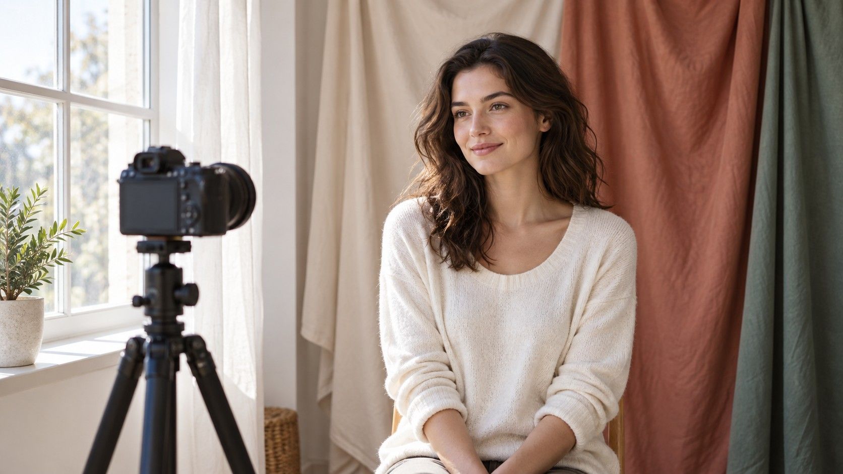
For a personal colour test, face an uncluttered window in daytime. Indirect light is better than a sunbeam because direct sun erases texture and creates hard yellow highlights. Turn off lamps, particularly warm ceiling bulbs and coloured LED strips. Remove tinted glasses, bronzer, strong lipstick and filters. If you normally wear glasses, take the test photo without them first, then repeat your offline comparisons with your frames on.
Use the rear camera if someone can take the photo for you; it often handles colour and detail more consistently than a front-facing selfie camera. Keep the phone at eye level and step back enough to show hairline, face and upper shoulders. A close-up can make a nose or under-eye shadow dominate the image, while a distant full-body shot gives the test too little colour information.
White balance is the hidden troublemaker. A phone may warm a blue room or cool a yellow wall automatically, making a warm face appear neutral from one shot to the next. Place a plain white sheet of paper briefly beside your face and take a second image. It does not fix every issue, but it gives you a reference image that can reveal obvious colour shifts between photos.
| Photo choice | Why it helps | What can go wrong |
|---|---|---|
| Shaded window light | Shows skin without mixed lamp colour | Strong direct sun adds harsh shadow |
| No beauty filter | Keeps redness and texture visible | Smoothing changes apparent contrast |
| Neutral background | Limits reflected colour near the face | Bright wall paint can cast colour onto skin |
| Two reference photos | Shows whether the result is repeatable | One lucky selfie can look more certain than it is |
Read the result as a set of clues
When a personal color test online suggests a season, translate it into plain observations. A cool result may be pointing toward blue-based reds, silver, charcoal or clear white. A warm result may be pointing toward cream, olive, tomato red and yellow gold. A soft result may mean that smoky, dusty versions of colours are easier than neon ones. A deep result may be telling you that pale pastels lack enough weight near your face.
Make a note of the three qualities that recur instead of memorising a long swatch fan. For example: cool, medium-deep and muted; or warm, light and clear. Those qualities are easier to test in a shop. They also make room for individual variation. You may find that cool navy works far better than black, while one supposedly suitable cool pink feels too bright. That is information, not a failure of the test.
Do not let a single output overrule evidence from your wardrobe. If the test calls you warm but every convincing comparison has been berry over coral and silver over yellow gold, repeat the test with better photos. The result may be responding to hair dye, a warm indoor photo or a screen correction. Your face next to fabric is the more direct evidence.
Check the suggested palette offline
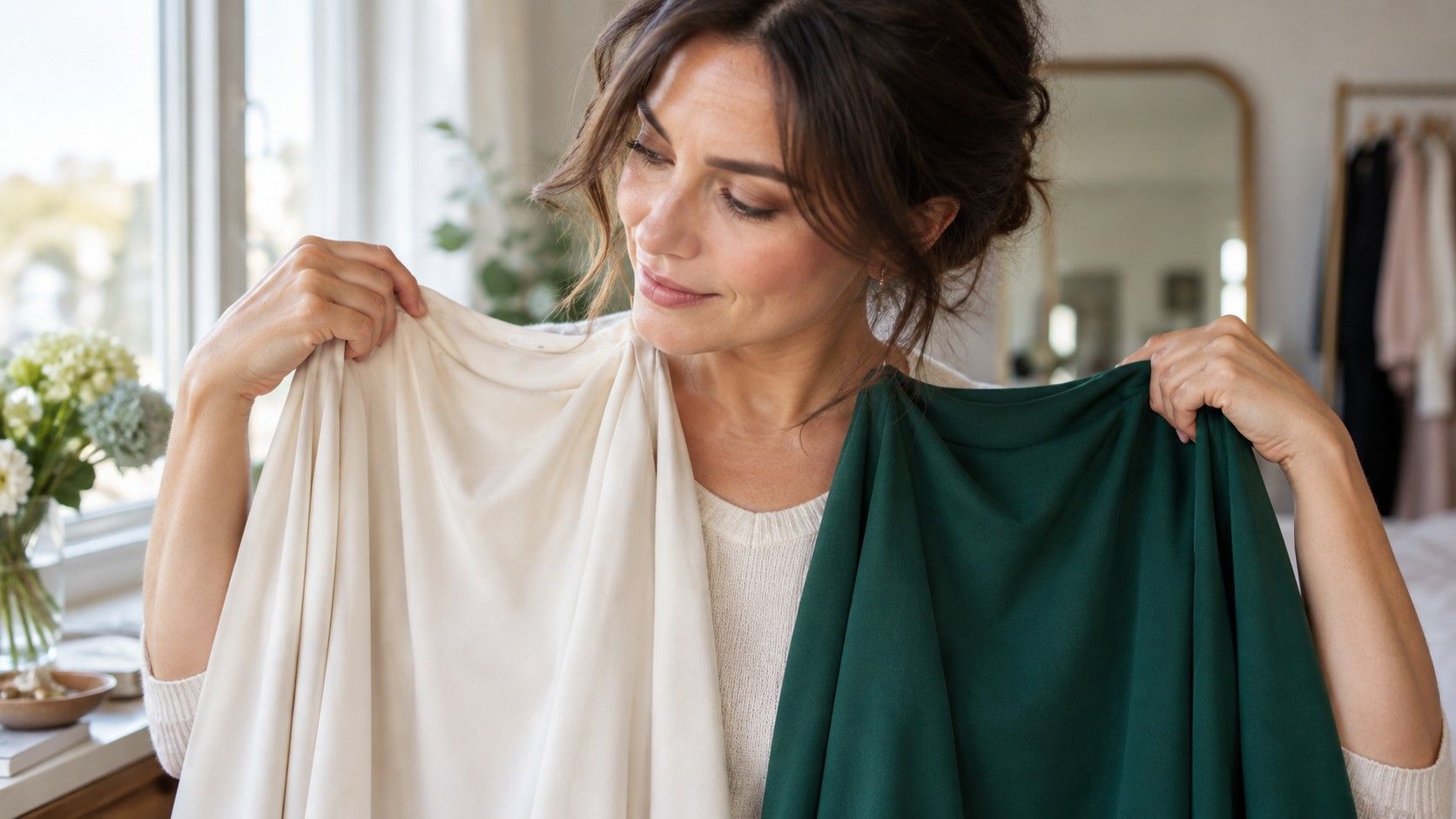
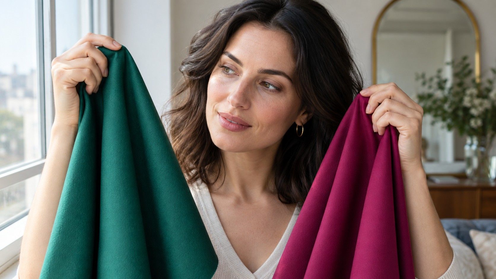
Choose four pairs of colours from the suggested direction and compare them at home: optic white and cream; coral and berry; camel and cool taupe; black and charcoal or navy. Hold each option under the chin in the same daylight. Watch the skin around the nose and mouth, the shadow beneath the eyes, and whether your eye colour becomes clearer or duller.
Use broad drapes whenever possible. A scarf, T-shirt or folded pillowcase is more revealing than a tiny paint chip because it reflects enough colour onto the lower face. Switch the order of the drapes after a few minutes. The first colour can make the second seem impressive merely because it was difficult; alternating helps you see the actual effect.
Give the comparisons two sessions. A tired morning, a slightly different foundation or overcast weather can all nudge a borderline result. The colours that keep winning under different conditions are the beginnings of a reliable personal palette. They are more valuable than a screen-generated list of thirty shades you have never worn.
Know when the test has picked the wrong direction
An online result deserves a second look when it makes nearly every familiar neutral feel wrong. If a test says you need bright black-and-white contrast but black makes your jawline look heavy and white pulls out redness, the direction may be too sharp. If it says warm but cream turns your skin yellow and blue-red makes your lips look clearer, explore cool or neutral options instead.
Hair changes are another reason to retest. Fresh blonde highlights, copper dye, very dark colour and natural grey can alter the contrast the camera reads. The underlying skin undertone does not suddenly transform, but the range of colours that works with your current overall look can shift. Take new photos after a major colour change rather than clinging to an old seasonal result.
Be cautious with tests that return a precise palette from one face photo in seconds. Precision on a screen can feel persuasive even when the input is weak. A trustworthy result should leave room for testing, explain qualities rather than issuing restrictions, and never suggest that a colour is forbidden because an algorithm has named a season.
Turn the result into useful everyday choices
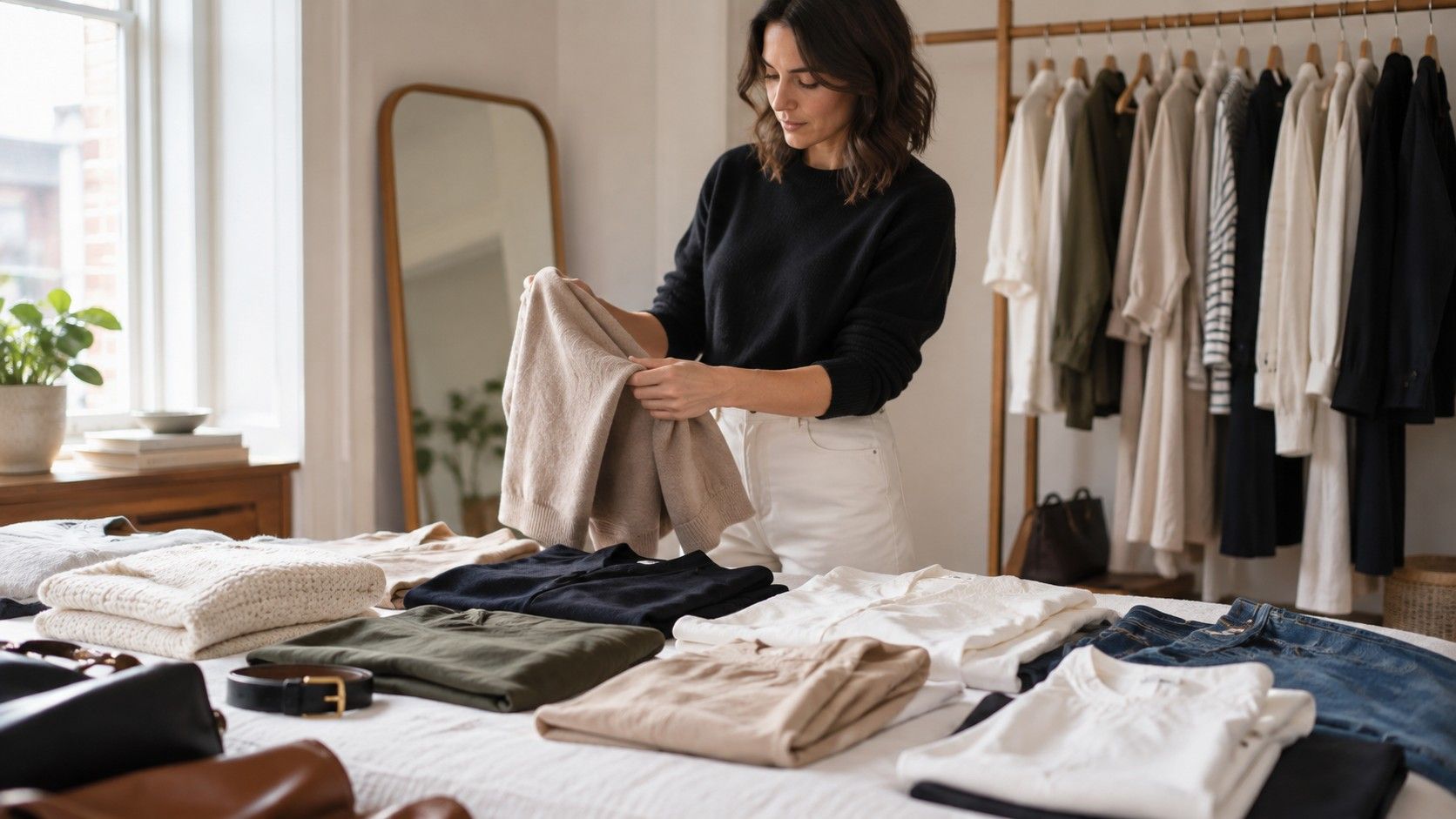
Build a small working palette rather than replacing your wardrobe. Pick two light neutrals, two dark neutrals, two colours that wake up your face and one accent you simply enjoy. If your test and drapes point toward cool softness, that might be oyster, dove grey, charcoal, navy, muted rose, smoky teal and berry. If they point warm and clear, try cream, camel, warm navy, leaf green, coral and tomato red.
Use the palette at the neckline first: tops, scarves, earrings, coat collars and glasses matter more than trousers. A colour that is difficult near the face can still be excellent in shoes or a bag. Keep a daylight photograph of your best three drapes on your phone and compare new clothes by a fitting-room window. Over time, the test result becomes less important than the calm recognition of colours that make you look awake.