Personal color analysis is most useful when it stops being a personality quiz and becomes a series of small comparisons: one shirt against another, one lipstick beside bare skin, one photograph taken by a window instead of under a yellow ceiling bulb. The aim is not to earn a flattering season label. It is to notice which colours let your face look clear, rested and present before the clothes get all the attention.
What personal color analysis is actually measuring
A proper color analysis looks at the relationship between a colour and the features already on your face. Skin tone is the surface colour you can see; undertone is the warmer, cooler or more neutral cast that tends to remain through sun exposure and winter. Then come value, meaning light versus dark, and chroma, meaning muted versus bright. These variables explain why two blues can feel completely different even when both are called navy in a shop.
The familiar seasonal color system gives those observations convenient names: Spring, Summer, Autumn and Winter, with softer or deeper variations inside each group. It is a useful filing cabinet, not a law of nature. Someone may borrow a deep neutral from Winter, a softened rose from Summer, and still look more coherent than they would in a strict four-colour uniform. A color analysis test is worthwhile only if it helps you see that pattern rather than pushing every answer toward a preset result.
Set up the first comparison in daylight
Begin near a north-facing window or outside in open shade, ideally late morning when the light is steady. Remove tinted glasses, heavy base makeup and a bright scarf that is already influencing the reflection on your jaw. A clean face does not mean a perfect face; it simply keeps bronzer, colour-corrector and warm bathroom lighting from voting before you do. Tie hair back if its highlights distract you, but do not cover it permanently: natural hair is part of the overall contrast you are learning to read.
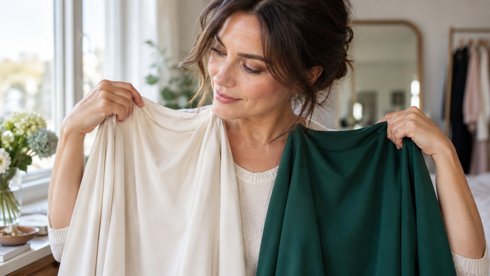
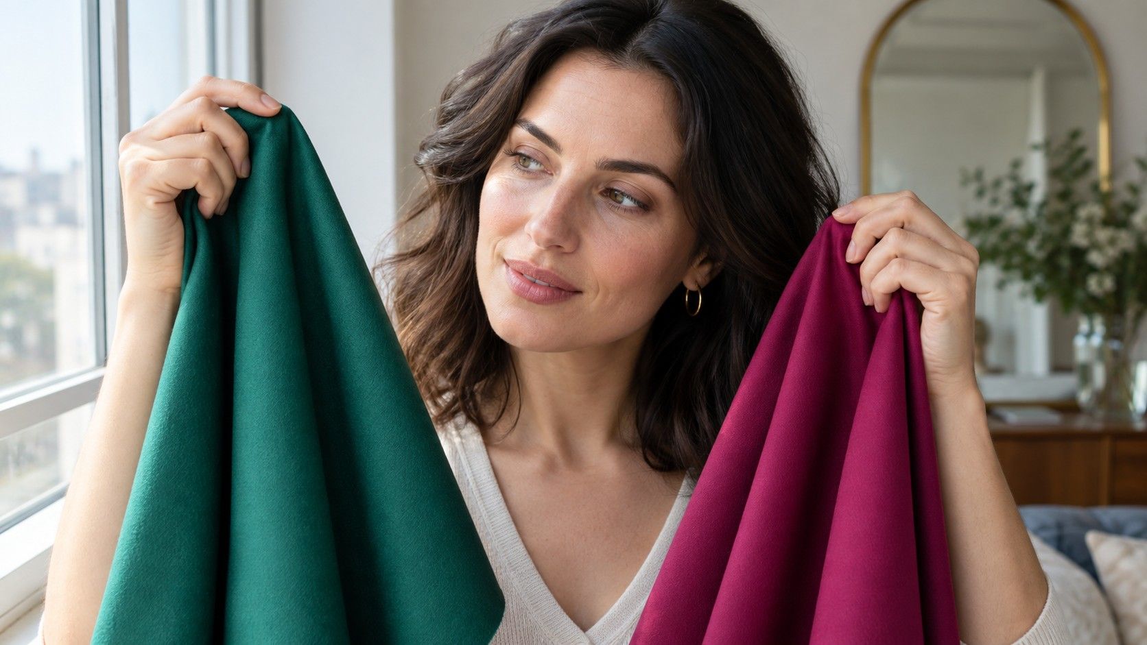
Use plain fabric, paper or tops in pairs. Hold cool charcoal beside warm camel, smoky rose beside peach, clear cobalt beside dusty blue. Keep the material under your chin for a few seconds, then look at the shadows around the nose, the under-eye area and the boundary of the lips. The better drape usually makes the skin look more even and the eyes more defined. The weaker one can make redness, grey shadows or texture appear first. Do not decide from a mirror held at arm's length; take a front-facing photo from the same spot as a useful second opinion.
Read temperature, value and chroma one at a time
Temperature is often overemphasised because warm versus cool feels easy to name. In practice, very few people look convincingly good in every warm or every cool shade. Compare cool raspberry with warm tomato red, or icy pink with apricot, and ask which one makes your complexion look less separate from your features. If both seem workable, you may be neutral or simply need to test value and intensity before declaring a winner.
Value is the next quiet clue. A person with pale skin, ash-brown hair and soft grey eyes can be overwhelmed by black even if their undertone is cool; charcoal, ink or soft navy may give the same depth without the hard outline. Conversely, a person with naturally dark hair and strong brows can disappear in oatmeal and pale dove grey. Chroma checks whether your colouring is blended and muted or naturally crisp. Put a muted sage beside a bright emerald, or a dusty berry beside fuchsia. The right level makes the face look intentional, not louder.
| What to compare | Useful pair | What to watch for |
|---|---|---|
| Temperature | cool pink and warm coral | evenness around the mouth and cheeks |
| Value | soft navy and near-black | whether the eyes remain visible before the garment |
| Chroma | dusty teal and bright turquoise | clarity versus a washed-out or overpowered effect |
| Contrast | one-colour outfit and light-dark outfit | whether your features need more or less definition |
Test colours without buying a new wardrobe
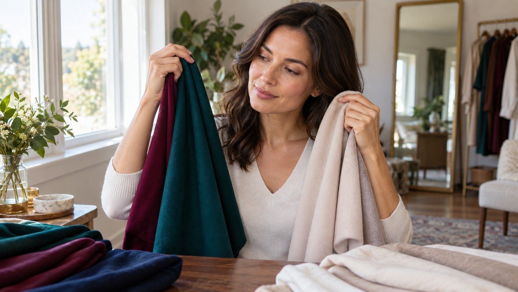
A free color analysis can start with what is already in a drawer. Gather ten to fifteen tops, scarves or pieces of fabric that represent your real choices, not only the colours you hope will suit you. Include trusted items and the shirt that repeatedly looks good on the hanger but somehow makes you look tired. Photograph each one in the same window light with the same camera setting. A contact sheet is more reliable than memory, which tends to reward the new or expensive item.
Keep the test short enough to stay observant. Compare two colours, make a note, and move on. When every piece has been judged against every other piece, the eye becomes fatigued and the result turns theatrical. It is also sensible to separate clothing from makeup. A warm nude lipstick may be lovely because it is close to your lip colour, while a warm beige sweater may flatten your face. The question is not whether a colour is objectively beautiful; it is whether its scale, finish and placement work beside your features.
Turn observations into a usable palette
Build a palette from evidence rather than a large online swatch card. First choose three to five neutrals you would actually wear: perhaps soft navy, mushroom, cool taupe, cocoa or deep olive. Add several face-framing colours that repeatedly made your skin look clearer, then one or two accent shades for bags, knitwear or lipstick. Write down the versions that worked, such as blue-red instead of orange-red, muted teal instead of bright turquoise, or cream instead of stark white. Those descriptions are far more useful in a changing shop than a tiny digital square.
Revisit the palette in another season and under ordinary circumstances. A tan, a new hair colour, stronger glasses or a shift from summer linen to winter wool can change the impression. This is not a failure of personal color analysis; it is why the best result is a flexible range. If a so-called wrong colour is part of your uniform or makes you happy, wear it away from the face, break it with a reliable neutral, or choose a softer version. The practical success of colour analysis is a wardrobe that produces fewer doubtful mornings, not a certificate saying you belong to one season forever.
Use the seasonal label as a shortcut, not a verdict
Once you have noticed recurring preferences, a season can help you search more efficiently. Soft, cool and low-contrast results often overlap with Summer palettes; clear, cool and high-contrast results may point toward Winter. Warm, light colours can suggest Spring, while warm, earthy and deeper combinations often suggest Autumn. But start with the physical comparisons. Calling yourself a Deep Winter before checking whether black really supports your face is an easy way to make the label do the seeing for you.
A good final check is the ordinary-life test: wear two newly promising colours on separate days, in daylight, with your usual hair and makeup routine. Notice whether colleagues say you look well without identifying the outfit, whether photographs need less correction, and whether you reach for the garment again. Those modest repetitions are more convincing than a dramatic before-and-after. They turn color analysis from a one-afternoon test into a dependable editing tool for clothes, accessories and makeup.