Olive skin can be confusing because it does not behave like the tidy warm-versus-cool examples often used in colour guides. In one light it may appear golden or beige; in another, the surface seems to hold a grey, yellow, or subtle green cast. That variation does not mean anything is wrong with the skin. It simply means the undertone is complex, and the most flattering colours are usually found through comparison rather than by matching a single label on a foundation bottle.
What people mean when they say olive skin tone
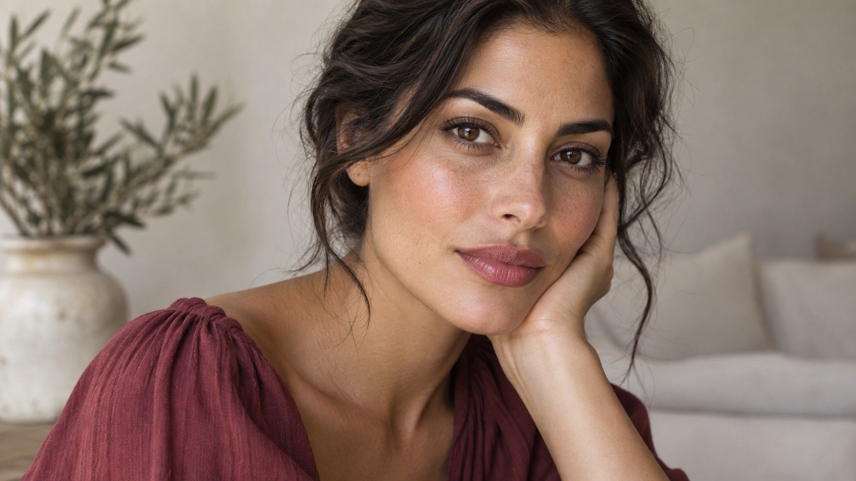
An olive skin tone usually has a muted mix of yellow, green, grey, or golden undertones beneath the surface colour. The surface may be fair, medium, tan, or deep. Fair olive skin can look almost neutral at first glance, especially beside a warm beige wall or under cool office lights. Pale olive skin is often mistaken for purely cool because pink foundation can look obvious, yet many pink foundations turn peach or orange after a few minutes against the skin.
Olive is an undertone description, not a depth category and not an ethnicity. Two people can both describe themselves as olive while one needs a light neutral-olive foundation and the other has a rich bronze complexion. The useful clue is consistency across lighting: when a standard warm or cool shade repeatedly looks too orange, too pink, or strangely separate from the neck, a muted olive undertone becomes a reasonable possibility.
Why olive can lean warm, cool, or neutral
Warm olive often has more golden or yellow presence and can look comfortable beside antique gold, camel, moss, warm coral, and rich brown. Cool olive tends to show more grey, blue, or muted green and may come alive in berry, charcoal, ink navy, cool mauve, and softened silver. Neutral olive can borrow from both sides, though very saturated orange and very icy pastels may still feel louder than the face. These are tendencies, not tests that must be passed.
Instead of deciding from vein colour or jewellery alone, compare colours near the jaw and chest in indirect daylight. A warm olive person may look fresh in olive green but sallow in icy lilac; a cool olive person may enjoy forest green but look yellow beside bright marigold. Notice the skin around the mouth and under the eyes. The right direction lets shadows recede slightly. The wrong one can bring forward a yellow-green cast, even if the garment itself is beautiful.
Start with quiet colours that reveal the undertone
Muted shades are often a forgiving starting point because they do not demand that the undertone be one simple thing. Try soft navy, eucalyptus, smoky teal, mushroom taupe, cocoa, muted burgundy, and a medium denim. These colours give olive skin enough depth without making every trace of yellow or grey look stronger. A vivid colour can work too, but it is easier to judge after you know whether your skin responds better to warmth, coolness, brightness, or softness.
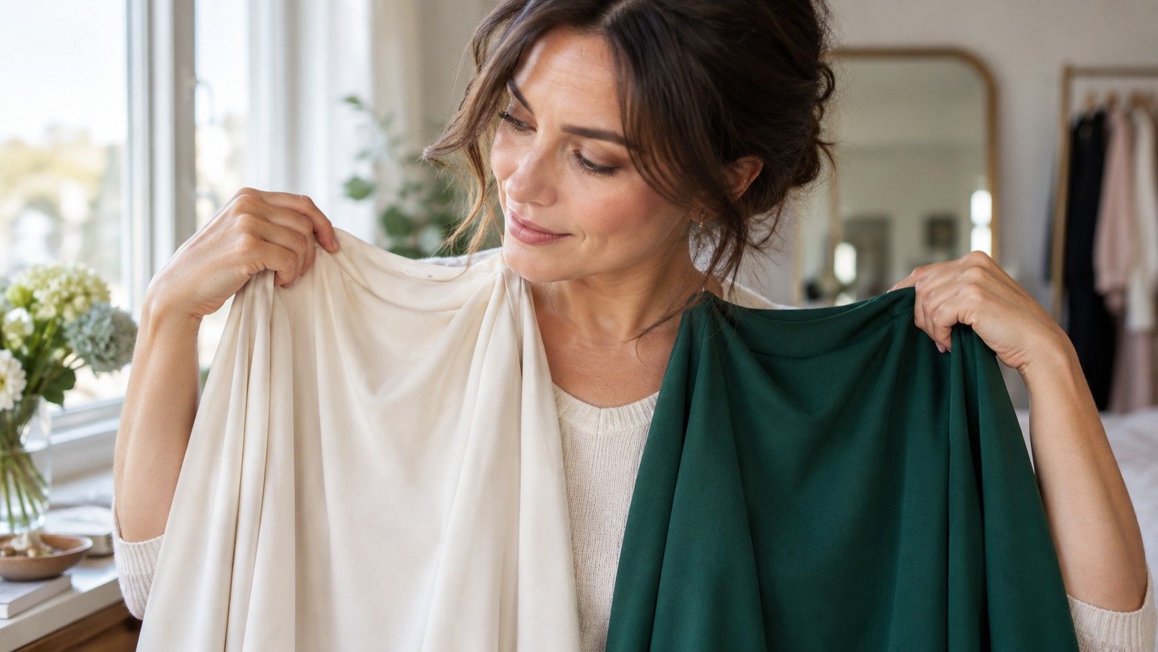
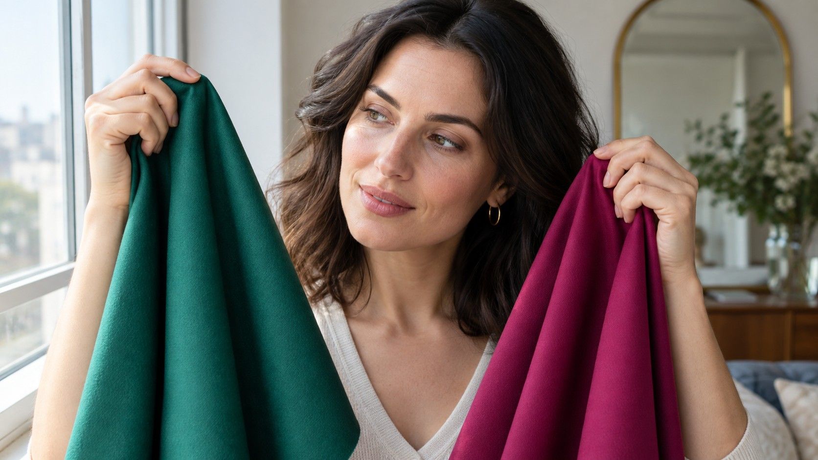
Test fabrics, not tiny digital swatches. A phone screen shifts colour, and an online product photo may be edited heavily. Hold a shirt, scarf, or towel under the chin, step back from the mirror, and take a few photos in the same daylight. Compare one variable at a time: dusty rose against coral, pine against yellow olive, plum against tomato red. If a shade makes the complexion look flat, do not assume the whole colour family is wrong; try a version with lower saturation or a different value.
| If this colour happens | Try adjusting | Useful next comparison |
|---|---|---|
| Bright orange makes skin look yellow | Choose a muted terracotta or warm berry | Coral versus softened brick |
| Baby pink looks disconnected | Move toward dusty rose or mauve | Cool blush versus muted berry |
| Black feels severe | Use ink navy, espresso, or charcoal | Black versus deep teal |
| Beige makes the face disappear | Choose mushroom, stone, or olive taupe | Warm camel versus greyed taupe |
When a shade makes olive skin look grey or sallow
The most common complaint is that a colour makes olive skin look grey, tired, or slightly green. Usually the problem is not simply “too cool” or “too warm.” It can be a mismatch of saturation. Very clear, neon-bright shades can sit on top of naturally muted skin, while chalky pastels may remove too much contrast. A pale icy blue may work beautifully on one cool olive person and make another look washed out because the value is too light rather than because the temperature is wrong.
Look for a colour that adds definition without producing a separate colour cast. If yellow is the issue, try a blue-based red, berry, emerald, or deep teal before abandoning colour altogether. If grey is the issue, add a little richness with bronze, cinnamon, peacock, or wine, depending on your warmth. The mirror test should include the neck and upper chest, not just the face; a foundation or top that looks acceptable in a close-up can appear oddly pink or orange once the whole area is visible.
Make foundation matching less frustrating
Foundation names are not a shared language. “Neutral” can mean beige in one range, peach in another, and visibly pink in a third. Start by swatching three shades in vertical stripes from cheek to neck: one neutral, one warm or golden, and one labelled olive when available. Let them sit for ten to fifteen minutes before deciding, because some formulas oxidise. The best match does not brighten the face or hide the undertone; it seems to disappear into the neck after it dries.
If olive-labelled shades are too deep, mixing is often more reliable than forcing a yellow shade to work. A small amount of a muted green or blue mixer can reduce an orange pull, but use it sparingly and test in daylight. The goal is not to make the base visibly green. It is to remove enough excess warmth or pink that the skin itself becomes the colour you see. For a fair olive skin tone, the right depth matters as much as the undertone: a perfect olive cast that is two shades too dark will still look like makeup.
Build contrast without fighting your undertone
Clothing choices become easier when you treat colour as a relationship. Olive skin often looks grounded with medium and deep neutrals: soft navy, dark olive, espresso, charcoal, deep taupe, and faded black. Then add contrast through one deliberate element, such as a berry lip, bronze earrings, a teal knit, or a cream shirt with an ink jacket. This is often more effective than collecting many “olive-approved” shades and wearing them all together.
For makeup, compare a bronzer with a berry blush rather than assuming bronze is always the answer. Warm olive skin may favour a golden bronze and warm rose; cool olive skin may prefer a neutral contour and a muted raspberry. Finish with an ordinary daylight check near a window, then one photo outdoors. If the product makes the face look alive but the skin still looks like skin, it is doing its job. The most useful olive skin palette is not a strict list of colours; it is the ability to spot when a shade supports the undertone instead of competing with it.