If you keep asking, what is my color palette, the useful answer is not a stranger naming twelve flattering swatches from one selfie. A personal palette is a working set of colours that cooperate with your skin, hair, eyes and natural contrast in the light where you actually live. You can find it with a few controlled comparisons, a notebook and enough patience to let the obvious favourites lose if the evidence says they should.
Decide what belongs in a personal palette
A wearable palette has jobs, not just pretty colours. It needs neutrals for coats, trousers, shoes and knitwear; face-framing shades for tops and scarves; accents that make an outfit feel less dutiful; and, if you use it, makeup colours that do not compete with the clothing. A wall of twenty bright squares may look satisfying online but tells you little about which beige makes a blazer useful or which red works with your everyday denim.
Begin by separating colour from style preference. You may like mustard, black or pale lavender because of its associations, but a useful palette asks what happens when that shade sits beside your face. The right colour often makes the whites of the eyes look clearer and the mouth look more defined. The less helpful one can make you notice under-eye shadows, unevenness or a grey cast first. That distinction is quieter than a makeover reveal, which is why it is easy to miss when you are rushing through a fitting room.
Make the first comparison in consistent light
Find a window with indirect daylight and use it for every test. Avoid sunset, car interiors and warm bathroom lamps; each can make warm colours seem kinder than they are. Remove tinted spectacles and, if possible, heavy blush or foundation. Pull hair back for the first pass so you can see the jawline and eyes clearly, then repeat with your natural hairstyle to check whether the result still feels believable. A colour palette has to survive your ordinary morning, not only a tidy experiment.
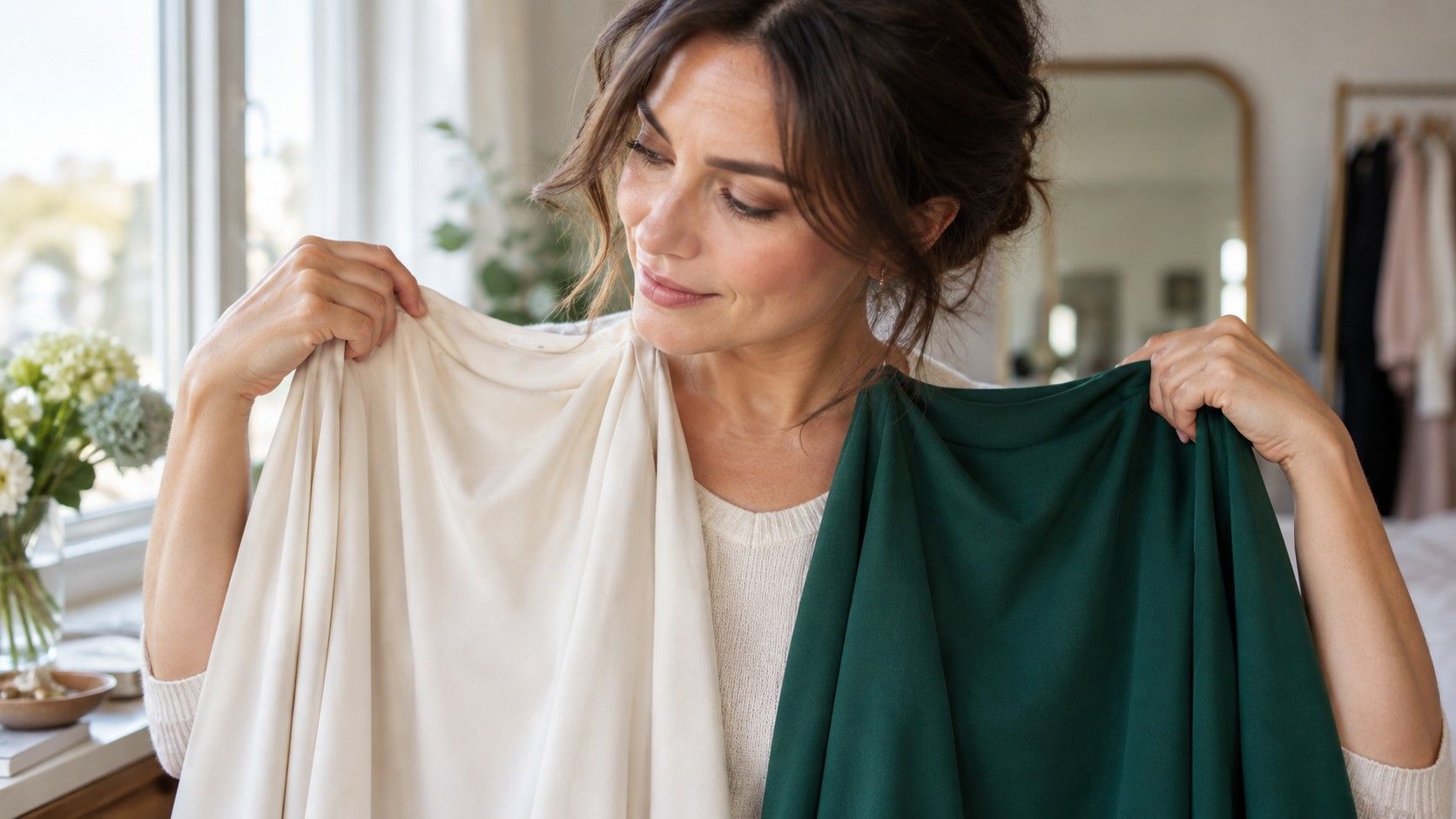
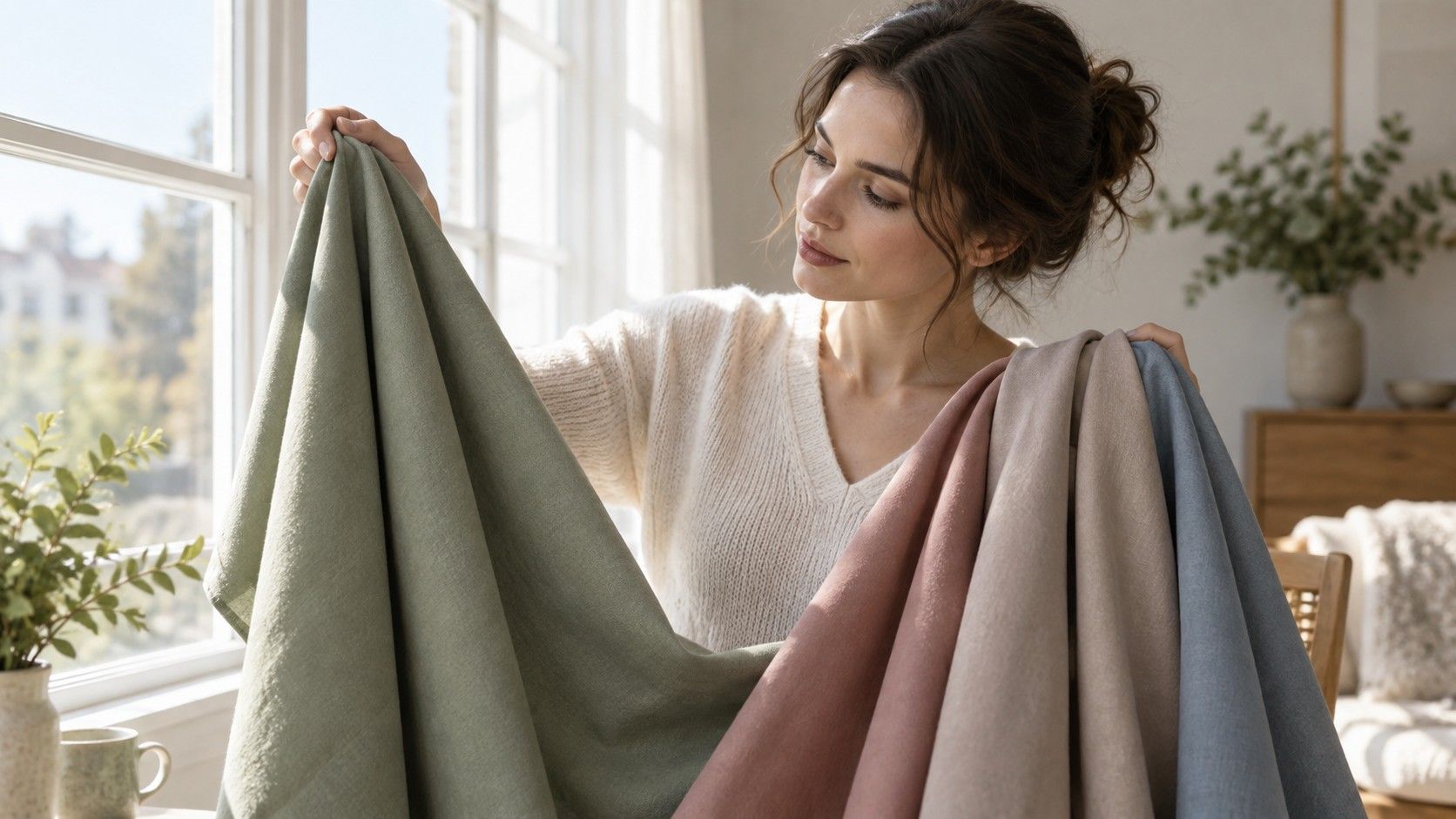
Place two fabrics under the chin: cool rose and peach, charcoal and camel, crisp white and softened ivory. Look for changes around the mouth, nose and under-eye area rather than judging the fabric itself. Then take photos from the same distance and camera setting. A photograph flattens some subtleties, but it also catches the moment when the eye has become attached to one colour simply because it is familiar. Compare only two or three pairs in one sitting. After an hour, almost every drape starts to look like a difficult moral choice.
Identify your useful neutrals before accent shades
Neutrals are the backbone of my color palette for most people because they appear closest to the face and get worn repeatedly. Test black against charcoal, bright white against cream, cool taupe against golden beige, navy against warm brown. Do not assume that a neutral is invisible. A harsh black can create a strong outline that looks excellent on someone with dark hair and clear features, while it may dominate a person with low contrast. The answer can be ink, espresso, slate or deep olive rather than a dramatic ban on dark clothes.
Choose three to five neutrals that can be worn together without looking as if each garment came from a different wardrobe. Consider fabric as well as hue: cool grey silk and washed grey cotton do not reflect light in the same way, and shiny satin can raise the apparent contrast of a colour. Before buying anything new, lay existing trousers, jackets and shoes on the bed. You may find that the best neutral has been there all along, simply paired with tops that do it no favours.
| Palette role | Try comparing | Keep it when |
|---|---|---|
| Dark neutral | black, charcoal, ink, espresso | your features stay visible and the face does not look shadowed |
| Light neutral | white, ivory, stone, soft grey | it brightens the face without making it look pale or washed out |
| Everyday colour | blue, green or berry in muted and clear versions | the eyes and lips look defined before the fabric does |
| Accent colour | coral, red, violet or teal | it adds energy without revealing redness or texture |
Check colour against your natural contrast
Contrast is the difference between the lightest and darkest parts of your colouring. It is not a score for attractiveness and it is not only about skin depth. Dark hair with pale skin often creates visible contrast; ash-blonde hair, soft brows and grey-blue eyes may create a blended effect even on fair skin. Look at a bare, daylight photo in grayscale if you want to see the pattern without the distraction of hue. This can explain why an outfit of strong black and white looks purposeful on one person and theatrical on another.
Test the amount of contrast in an outfit as well as the colour itself. Put a light top with medium trousers beside a light-dark combination using the same top. If your features gain definition with the stronger version, you may tolerate more contrast. If the clothes arrive before your face does, soften one side of the pairing. Hair colour matters here too. Fresh highlights, a dark dye job or a silver transition can alter the balance enough that an old palette needs adjustment. It is sensible to retest rather than defend yesterday's category.
Use makeup and accessories as small experiments
Makeup is a fast way to check temperature and intensity because it sits in a concentrated area. Compare a muted rose lip with a clear berry, or a peach blush with a neutral pink, in daylight and without a competing bright top. A good shade makes the face look awake even when the rest of the makeup is minimal. If a lipstick appears to sit on the face as a separate stripe, the problem may be chroma rather than warm versus cool; a dustier or deeper version can solve it.
Accessories are helpful when you love a colour that is less reliable near your face. A warm leather bag, vivid shoes or a mustard skirt can still belong in a wardrobe whose best face-framing shades are cool and muted. Earrings and scarves deserve more scrutiny because they reflect colour upward. Gold and silver tests can be useful, but finish matters: antique gold, brushed silver and rose gold do not behave like bright jewellery-store metal. Treat them as evidence among several tests, not as an undertone detector with absolute authority.
Keep a small record of colours that prove themselves
To find my color palette in a way that lasts, I keep the result modest. Take daylight photographs of the winners, save a note with names such as smoky navy, soft white, muted raspberry or olive green, and record why each one worked. A digital folder is fine, but include a real fabric cutting or paint card when possible; screens alter saturation and retailers rename the same shade every season. The goal is not to own an official swatch fan. It is to have a reference when a shop is full of nearly-right colours.
Give the palette a trial month. Wear one likely neutral and one likely face-framing colour several times, with your normal hair, glasses and makeup. Notice which pieces are easy to combine, which photograph well without filters and which prompt the quiet comment that you look rested. If a shade only works in a perfect mirror at noon, it is not a dependable core colour. Keep the palette flexible enough for taste and changing hair, but strict enough to stop expensive near-misses from becoming permanent residents of the wardrobe.
Translate the result into everyday shopping decisions
When you are shopping, start with the face-framing zone. Hold a top or jacket near the chin before inspecting the cut, then compare it with the closest alternative on the rail. If neither works, leave both behind. This sounds severe, but it is kinder than buying the more flattering wrong option and trying to rescue it later with lipstick, a scarf and optimism. For trousers, skirts and shoes, the colour can be more flexible because it is farther from the face.
Your palette should reduce decisions, not introduce fear. There is room for a favourite unusual shade, a costume-like evening look or a trend that does not match the core evidence. Use a reliable neutral nearby, choose the more muted or deeper version, or place the difficult colour below the waist. Over time, the successful combinations become recognisable: the same few blues, browns, berries or greens keep making sense. That practical repetition is the answer to what is my color palette, and it is more valuable than any one label attached to it.